Assignment 6: Data wrangling I#
In the last two assignments you’ve explored data with both basic statistical methods and different types of data visualization. While this is a key part of the data analysis process, datasets need to be in the right format before analysts can start drawing meaningful conclusions. The process of preparing data for analysis is called data wrangling, and often takes the bulk of an analysts’ time during a data project. Possible issues might include:
Missing data or problematic/incorrect values in a dataset;
Data are formatted incorrectly, preventing the analyst from working with the data in the right way;
Data are spread across multiple files or data tables;
Data are in the wrong “shape” for analysis and visualization
All of the above, in varying capacities!
A major reason why you are learning to work with pandas in this course is because it can flexibly handle all of these tasks. In this notebook, we’ll be going over some basic examples of how this works, which you’ll then put into practice with the Exercises at the end.
In this notebook, we’ll be working primarily with the US Department of Education’s College Scorecard dataset. Read in the full dataset with the code below.
import pandas as pd

full_url = 'http://personal.tcu.edu/kylewalker/data/colleges.csv'
full = pd.read_csv(full_url, encoding = 'latin_1')
full.shape
(7804, 122)
We see that our data have over 7800 rows, and a whopping 122 columns! At this point, while you might not know yet what insights are contained in the data, you will have some sense of the research questions that you are interested in. As your research questions don’t likely require all 122 columns, you can safely restrict your dataset to only those columns that you need for your analysis. Our core research question is as follows:
How does the proportion of non-traditional students - defined as undergraduate students aged 25 and above - vary among comparable bachelor’s-granting colleges and universities?
To accomplish this, we’ll need to identify some columns that we need and subset our data accordingly. The columns we’ll be keeping are as follows:
INSTNM: The name of the institution;STABBR: The state the institution is located in;PREDDEG: The primary type of degree granted by the institution; codes include 1 for certificates, 2 for associate’s degrees, 3 for bachelor’s degrees, and 4 for graduate degrees;CONTROL: The ownership of the institution, coded as 1 for public non-profit, 2 for private non-profit, and 3 for private for-profit;UGDS: The number of undergraduates enrolled at the institution;UG25abv: The percentage of undergraduates at the institution aged 25 and above.
Subsetting data#
As we discussed in class, pandas includes many different methods for subsetting data; I encourage you to review the corresponding lecture notes for the full set of methods that we discussed. In this notebook, we’ll be focusing on the methods that allow us to accomplish the task at hand, and you’ll be learning a few new methods as well.
To subset our data column-wise, we can specify a list of column names that we want to keep then use the .filter() method to restrict our data to only those specified columns.
keep = ['INSTNM', 'STABBR', 'PREDDEG', 'CONTROL', 'UGDS', 'UG25abv']

df = full.filter(keep)

df.head()
| INSTNM | STABBR | PREDDEG | CONTROL | UGDS | UG25abv | |
|---|---|---|---|---|---|---|
| 0 | Alabama A & M University | AL | 3 | 1 | 4051.0 | 0.1049 |
| 1 | University of Alabama at Birmingham | AL | 3 | 1 | 11200.0 | 0.2422 |
| 2 | Amridge University | AL | 3 | 2 | 322.0 | 0.8540 |
| 3 | University of Alabama in Huntsville | AL | 3 | 1 | 5525.0 | 0.2640 |
| 4 | Alabama State University | AL | 3 | 1 | 5354.0 | 0.1270 |
Our data are much simpler to work with now! We can already see some noticeable variations in the data; over 85 percent of students at Amridge University are over age 25; however, the university itself is quite small with only 322 undergraduates. These are the types of things we’ll want to account for in our analysis.
You may have noticed that I decided to assign the result of the subsetting operation to a new data frame. Certainly, I could have assigned the result back to the original frame:
full = full.filter(keep)
Or:
full.filter(keep, inplace = True)
My personal preference when doing data programming is to assign the results of major operations to new data frames, creating a data frame object that represents each step of the analysis, and do minor operations in place. For example, had I assigned the results of the subsetting operation back to full, and I later decided that I needed an additional column from the original data frame, I’d need to read the whole thing in again rather than just add a column name to the list keep. Python will hold all of our data in memory, so it will be accessible to us throughout our Python session; given that our data are relatively small, this won’t cause us any problems. Bigger data workflows might require different methods, however.
There are small things, however, that you can do to your data frame in place to make your lives easier. For example, I don’t really want to hit Caps Lock or the Shift key every time I am typing out column names, but my column names are capitalized. Our column names in our data frame are simply a list of strings, which we’ve learned how to work with already with string methods. As such, we can use list comprehension to convert all of the column names to lower case:
df.columns = [x.lower() for x in df.columns]

df.head()
| instnm | stabbr | preddeg | control | ugds | ug25abv | |
|---|---|---|---|---|---|---|
| 0 | Alabama A & M University | AL | 3 | 1 | 4051.0 | 0.1049 |
| 1 | University of Alabama at Birmingham | AL | 3 | 1 | 11200.0 | 0.2422 |
| 2 | Amridge University | AL | 3 | 2 | 322.0 | 0.8540 |
| 3 | University of Alabama in Huntsville | AL | 3 | 1 | 5525.0 | 0.2640 |
| 4 | Alabama State University | AL | 3 | 1 | 5354.0 | 0.1270 |
You’ve also already learned to modify the column names of your data frame by passing in a list of new names. Individual names can be modified as well. For example, I think 'state' makes a lot more sense as a column name than 'stabbr', so I’m going to change it. The following code gets this done:
df.rename(columns = {'stabbr': 'state'}, inplace = True)

df.head()
| instnm | state | preddeg | control | ugds | ug25abv | |
|---|---|---|---|---|---|---|
| 0 | Alabama A & M University | AL | 3 | 1 | 4051.0 | 0.1049 |
| 1 | University of Alabama at Birmingham | AL | 3 | 1 | 11200.0 | 0.2422 |
| 2 | Amridge University | AL | 3 | 2 | 322.0 | 0.8540 |
| 3 | University of Alabama in Huntsville | AL | 3 | 1 | 5525.0 | 0.2640 |
| 4 | Alabama State University | AL | 3 | 1 | 5354.0 | 0.1270 |
The rename data frame method takes a dictionary of values, which is a Python data structure that we haven’t discussed yet. Dictionaries, or dict objects as they are often called, are enclosed by curly braces ({}) and are made up of key/value pairs. In turn, they can really come in handy when working with paired values; we may return to them later in the semester. As this is a minor change to the data frame, the argument inplace = True makes sense to modify df directly.
We now want to subset our data even further. As mentioned above, the preddeg column designates the primary degree granted by the colleges and universities in the dataset. We’re interested in comparing primarily bachelor’s-granting universities, which have the code of 3; in turn, we want to tell pandas to keep only those rows where the preddeg column is equal to 3. First, let’s check our dtypes to see if the columns is formatted as a string or number:
df.dtypes
instnm      object
state       object
preddeg      int64
control      int64
ugds       float64
ug25abv    float64
dtype: object
It appears as though preddeg is an integer, so we will work with the values as numbers. To subset rows in pandas, we can use the .query() data frame method. .query() requires an expression to be evaluated by Python using boolean/logical operators. The method will then return those rows for which the result of the expression is True, and drop those rows that return False. In this case, we want all of those rows for which the value of the preddeg column is equal to 3. Let’s create a new dataframe, called ug for undergraduate, from this expression.
ug = df.query('preddeg == 3')

ug.shape
(2133, 6)
We’ve gone from over 7800 colleges & universities down to 2133.
Missing data#
As mentioned in class, missing data in pandas are designated with the value NaN, which refers to “not a number.” Data analysts need to take missing data seriously, as they could be representative of a systematic flaw in the dataset. You can check for missing values in pandas with the .isnull() method. Let’s query our undergradate data frame to check to see how many rows in our dataset have missing values for our column of interest, ug25abv. Note that we need the argument engine = 'python' in this example as we are using a pandas method within the expression.
ugnull = ug.query('ug25abv.isnull()', engine = 'python')

ugnull.shape
(36, 6)
It looks like we have 36 rows with null values for the ug25abv column. Let’s see what universities they are:
ugnull
| instnm | state | preddeg | control | ugds | ug25abv | |
|---|---|---|---|---|---|---|
| 104 | Frank Lloyd Wright School of Architecture | AZ | 3 | 2 | 2.0 | NaN |
| 649 | Yeshiva Ohr Elchonon Chabad West Coast Talmudi... | CA | 3 | 2 | 131.0 | NaN |
| 1171 | Rosalind Franklin University of Medicine and S... | IL | 3 | 2 | NaN | NaN |
| 1893 | New England College of Optometry | MA | 3 | 2 | NaN | NaN |
| 2598 | Beth Hatalmud Rabbinical College | NY | 3 | 2 | 47.0 | NaN |
| 2599 | Beth Hamedrash Shaarei Yosher Institute | NY | 3 | 2 | 49.0 | NaN |
| 2668 | Yeshiva of Far Rockaway Derech Ayson Rabbinica... | NY | 3 | 2 | 57.0 | NaN |
| 2707 | Kehilath Yakov Rabbinical Seminary | NY | 3 | 2 | 120.0 | NaN |
| 2733 | Mesivtha Tifereth Jerusalem of America | NY | 3 | 2 | 50.0 | NaN |
| 2767 | Ohr Hameir Theological Seminary | NY | 3 | 2 | 94.0 | NaN |
| 2781 | Rabbinical College Bobover Yeshiva Bnei Zion | NY | 3 | 2 | 263.0 | NaN |
| 2783 | Rabbinical College Beth Shraga | NY | 3 | 2 | 47.0 | NaN |
| 2785 | Rabbinical College of Long Island | NY | 3 | 2 | 96.0 | NaN |
| 2854 | Talmudical Seminary Oholei Torah | NY | 3 | 2 | 321.0 | NaN |
| 2859 | Torah Temimah Talmudical Seminary | NY | 3 | 2 | 180.0 | NaN |
| 2875 | Webb Institute | NY | 3 | 2 | 82.0 | NaN |
| 2882 | Yeshiva Karlin Stolin | NY | 3 | 2 | 119.0 | NaN |
| 2886 | Yeshiva Shaar Hatorah | NY | 3 | 2 | 75.0 | NaN |
| 2889 | Yeshivath Zichron Moshe | NY | 3 | 2 | 164.0 | NaN |
| 2920 | Davidson College | NC | 3 | 2 | 1782.0 | NaN |
| 3657 | Talmudical Yeshiva of Philadelphia | PA | 3 | 2 | 124.0 | NaN |
| 4268 | Washington and Lee University | VA | 3 | 2 | 1846.0 | NaN |
| 4622 | Yeshiva Gedolah of Greater Detroit | MI | 3 | 2 | 58.0 | NaN |
| 4915 | Yeshiva Gedolah Imrei Yosef D'spinka | NY | 3 | 2 | 125.0 | NaN |
| 5066 | Rabbi Jacob Joseph School | NJ | 3 | 2 | 86.0 | NaN |
| 5152 | Yeshivas Novominsk | NY | 3 | 2 | 118.0 | NaN |
| 5433 | Yeshiva D'monsey Rabbinical College | NY | 3 | 2 | 48.0 | NaN |
| 5585 | Yeshiva of the Telshe Alumni | NY | 3 | 2 | 126.0 | NaN |
| 5884 | Yeshiva Shaarei Torah of Rockland | NY | 3 | 2 | 116.0 | NaN |
| 5909 | Franklin W Olin College of Engineering | MA | 3 | 2 | 343.0 | NaN |
| 6061 | Beis Medrash Heichal Dovid | NY | 3 | 2 | 96.0 | NaN |
| 6566 | Yeshiva Toras Chaim | NJ | 3 | 2 | 182.0 | NaN |
| 7520 | Bais HaMedrash and Mesivta of Baltimore | MD | 3 | 2 | 49.0 | NaN |
| 7528 | Be'er Yaakov Talmudic Seminary | NY | 3 | 2 | 298.0 | NaN |
| 7689 | Yeshiva Gedolah Kesser Torah | NY | 3 | 2 | 70.0 | NaN |
| 7691 | Yeshiva Yesodei Hatorah | NJ | 3 | 2 | 64.0 | NaN |
Interesting! It looks like primarily we’ve returned Jewish yeshivas as well as a few graduate colleges - e.g. New England College of Optometry which is designated as a bachelor’s granting institution but has no undergraduates - that appear to have been mis-coded. This reveals why careful inspection of your data is important. Missing values often aren’t at random, but instead may be systematic or clustered amongst a particular type of record in your dataset. Additionally, it looks like we’ve uncovered some errors in the original data as well.
In this case, let’s go ahead and drop these records from our dataset. Recall from class that there are other options available for missing data as well; you can fill the NaN values with some other value if appropriate, such as 0 or the mean of the column. We’ll drop these values using .query() again, but instead with the .notna() pandas method. This method will identify the rows that are not NaN in the ug25abv column, and retain only those rows.
ug_nonull = ug.query('ug25abv.notna()', engine = 'python')

ug_nonull.shape
(2097, 6)
I can also use the .dropna() method, which we learned in class. One thing about .dropna() is that it can operate over the entire data frame if we don’t pass it any columns. Let’s check it out:
ug1 = ug.dropna()

ug1.shape
(2097, 6)
We get the same result, which means that we’ve also removed any of the rows that had null values in the ugds column.
Group-wise data analysis#
In class, we discussed the “split-apply-combine” approach to data analysis. This approach involves:
Splitting the data into groups based on some common characteristic;
Applying some function to each group;
Combining the results back into a single dataset, allowing for group-wise comparisons.
While conceptually simple, this approach to data analysis is extraordinarily powerful - and extremely common! For example, let’s say you are working in analytics for a business, and your supervisor wants you to compare sales results of your stores by region. This is a very common request when working with data professionally, and fortunately pandas can help you out with this with minimal code.
Let’s start with a couple guiding questions.
How does the proportion of undergraduate students above age 25 vary among public, private, and for-profit universities?
How does the proportion of undergraduate students above age 25 vary by institution size?
Group-wise data analysis in pandas is conducted by the creation of a groupby object, in which you tell pandas exactly how the data should be grouped. To address the first question, we’ll want to group our data by institution type. The code below gets this done.
groups1 = ug1.groupby('control')

type(groups1)
pandas.core.groupby.generic.DataFrameGroupBy
Notice the object type - Python knows that our new object, groups1, represents grouped data. In turn, anything we calculate over this object will apply to each of our groups, defined by unique values of the control column. Let’s try:
groups1.ug25abv.mean()
control
1    0.215475
2    0.235799
3    0.670381
Name: ug25abv, dtype: float64
Interesting stuff - whereas public and private non-profit colleges and universities are pretty similar in their age composition, with 21-23 percent of their student bodies above age 25, private for-profit universities are quite different, with over two-thirds of their undergraduates aged over 25.
Let’s visualize this with seaborn, which also sets up very nicely for group-wise data analysis. Box plots and violin plots, for example, can be extended by specifying a second column for the plot.
import seaborn as sns
sns.set(style = "darkgrid")

sns.boxplot(data = ug1, x = 'control', y = 'ug25abv')
<Axes: xlabel='control', ylabel='ug25abv'>
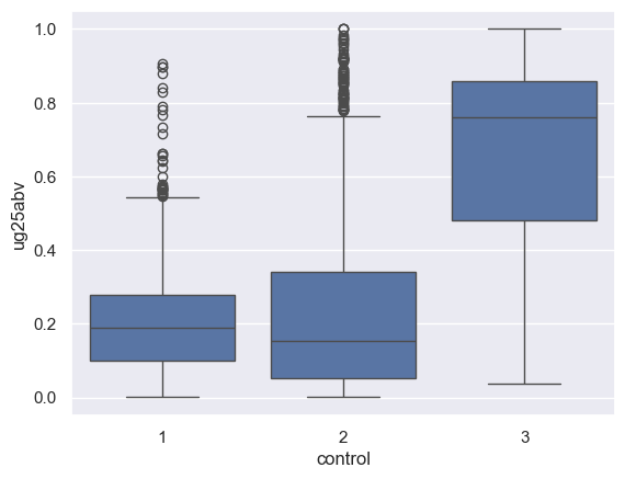
We can get a clear sense here of the variations of the distributions between the groups. While the mean percentage of undergraduates above 25 at public non-profits was below that of private non-profits, it appears as though the median for private non-profits is lower; there is simply a longer tail of private non-profits with large proportions of their student bodies above 25. For private for-profits, the distribution is quite evident - with the median value above 70 percent.
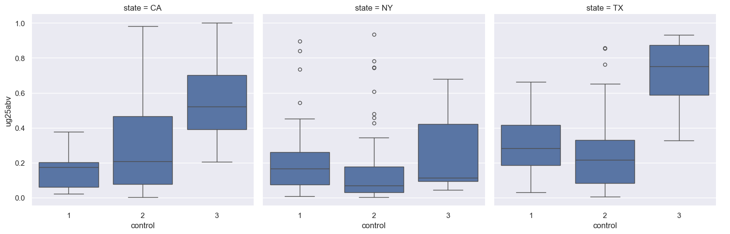
seaborn includes even more functionality for group-wise visualization - incorporating, in some instances, multiple groups! We’ll learn more about this in a couple weeks when we focus on data visualization; however we can take a look right now. The catplot function in seaborn allows you to split categorical plots such as point (the default), box, violin, bar, or strip plots into separate smaller charts, to facilitate comparisons across groups.
Let’s create a new subsetted data frame, sub1, by indexing our ug1 data frame for only those colleges and universities that are located in New York, Texas, and California. We then call the catplot function, specifying how to divide our plots into small multiples with the col = 'state' argument.
sub1 = ug1.query("state in ['NY', 'TX', 'CA']", engine = 'python')

sns.catplot(data = sub1, x = 'control', y = 'ug25abv',
               col = 'state', kind = 'box', order = [1, 2, 3])
<seaborn.axisgrid.FacetGrid at 0x1550bde90>
Now, we want to look at how the percentage of undergraduates over age 25 varies by institution size. Certainly, we could create a scatter plot as both the ug25abv and ugds columns are numeric:
sns.lmplot(data = ug1, x = 'ugds', y = 'ug25abv')
<seaborn.axisgrid.FacetGrid at 0x1553b82d0>
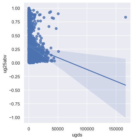
The regression line suggests an inverse relationship; however the clustering of dots suggests (potentially) a non-linear relationship, and there are several outliers. For example:
ug1.query('ugds > 150000')
| instnm | state | preddeg | control | ugds | ug25abv | |
|---|---|---|---|---|---|---|
| 4880 | University of Phoenix-Online Campus | AZ | 3 | 3 | 166816.0 | 0.8368 |
The University of Phoenix-Online, with over 160,000 students, stands out as a distinct outlier. Additionally, a scatter plot is not the only way that we can assess this relationship. We can convert our data from quantitative to categorical, and in turn assess variations amongst the categories.
Creating new columns#
Creating a categorical column from a quantitative column requires computing a new column in our data frame, which will be a common part of your workflow in pandas. As you learned in class, you can use basic mathematical operations to create new columns from existing ones. In this example, we are going to organize our universities into bins based on their size, and then compare universities across those bins.
pandas includes a lot of methods for creating new columns; we’re going to discuss here options for organizing our data into bins. The three options are as follows:
Equal interval: all bins have the same width, regardless of the number of observations in each bin.
Manual breaks: the analyst specifies where the bin breaks should be located
Quantile: An equal number of observations are organized into a specified number of bins; bins widths will in turn be irregular.
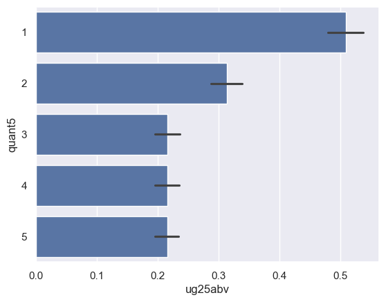
Equal interval and manual breaks are available via the cut() function in pandas; quantiles are available from the qcut() function. Let’s create a new column with the .assign() method that organizes the values in ugds into five quantiles, labeled with 1 through 5 which we accomplish with range():
ug_quantiles = ug1.assign(quant5 = pd.qcut(ug.ugds, 5, labels = range(1, 6)))

ug_quantiles.head()
| instnm | state | preddeg | control | ugds | ug25abv | quant5 | |
|---|---|---|---|---|---|---|---|
| 0 | Alabama A & M University | AL | 3 | 1 | 4051.0 | 0.1049 | 4 |
| 1 | University of Alabama at Birmingham | AL | 3 | 1 | 11200.0 | 0.2422 | 5 |
| 2 | Amridge University | AL | 3 | 2 | 322.0 | 0.8540 | 1 |
| 3 | University of Alabama in Huntsville | AL | 3 | 1 | 5525.0 | 0.2640 | 4 |
| 4 | Alabama State University | AL | 3 | 1 | 5354.0 | 0.1270 | 4 |
We can now make comparisons by quantile if we want. Let’s try a bar chart; seaborn’s barplot function will calculate group means and plot them, and give us an indication of the uncertainty around that mean with an error bar:
sns.barplot(x = 'ug25abv', y = 'quant5', data = ug_quantiles)
<Axes: xlabel='ug25abv', ylabel='quant5'>
We can analyze this further by breaking out the bar charts by college type with sns.catplot():
sns.catplot(data = ug_quantiles, x = 'ug25abv', y = 'quant5', col = 'control', kind = 'bar')
<seaborn.axisgrid.FacetGrid at 0x1551ea5d0>
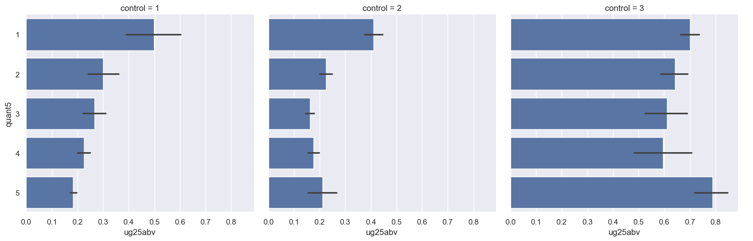
Our results appear quite different when we break them out by college type! This starts to reveal the importance of detailed investigation of your data through visualization; we’ll be exploring this much more in the next few weeks. We can also take a look at the numbers behind these plots by creating a groupby object that groups by control and the quantiles:
groups2 = ug_quantiles.groupby(['control', 'quant5'])

groups2.ug25abv.mean()
/var/folders/qm/xbtsglmj2ss91z9fzpz8k6q8ylngb5/T/ipykernel_3753/3952301497.py:1: FutureWarning: The default of observed=False is deprecated and will be changed to True in a future version of pandas. Pass observed=False to retain current behavior or observed=True to adopt the future default and silence this warning.
  groups2 = ug_quantiles.groupby(['control', 'quant5'])
control  quant5
1        1         0.498289
         2         0.298886
         3         0.265841
         4         0.224723
         5         0.183518
2        1         0.410560
         2         0.225184
         3         0.162080
         4         0.176742
         5         0.210676
3        1         0.701017
         2         0.641752
         3         0.610130
         4         0.594723
         5         0.787532
Name: ug25abv, dtype: float64
Exercises#
You’ll now complete some exercises so you can practice what you’ve learned. Your job, in general, is to replicate the analysis above, but for a different column in the dataset. You’ll be analyzing the column PCTPELL, which denotes the percentages of students receiving Pell Grants, a federal grant program to help students pay for college. Unlike loans, Pell Grants do not need to be repaid.
While you’ll be using a lot of the code I provided for you and modifying it slightly, make sure that you know what the code is doing at every step!
Exercise 1: Similar to what you did earlier in the notebook, create a data frame that is subsetted for the columns 'INSTNM', 'STABBR', 'PREDDEG', 'CONTROL', 'UGDS', and 'PCTPELL', and that retains only those rows where PREDDEG is equal to 3, representing primarily bachelor’s-granting universities. What is the mean, median, maximum value, and minimum value of the PCTPELL column?
Exercise 2: How many null values are contained in the PCTPELL column in your subsetted data frame? Once you’ve found this out, drop them from your data frame.
Exercise 3: Compare the means of PCTPELL by the different groups of CONTROL (the college/university type). Draw a visualization that shows how the distributions vary.
Exercise 4: Draw a visualization that breaks your visualization from Exercise 3 down by state with catplot, similar to what you did earlier in the notebook; in this instance, however, compare Texas with Florida and Illinois.
Exercise 5: Show how the percent of students receiving Pell Grants varies by institution size and institution type (public, private, for-profit). Break up the UGDS column into five quantiles in your data frame as you did before, and then compare the means of PCTPELL by institution type by institution size. Draw a visualization with catplot to show this graphically.