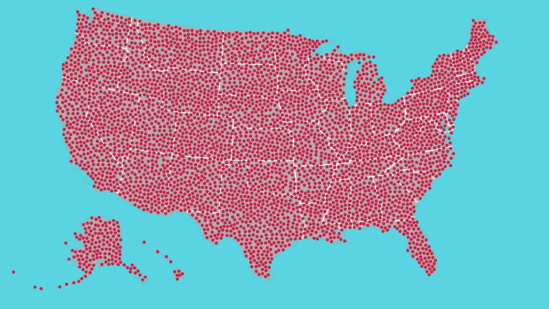
Seven hundred of them. Seven hundred dots. That’s more than 500 dots—well on the way to 1,000. That could represent 700 people, or crime scenes, or cities. Or something that happens in this country every 20 seconds. These dots could potentially be anything—they’re red dots, so they could definitely mean something bad.
The article is of course satirical, and is poking fun at “amazing maps” published on social media from which much is inferred, but in reality don’t say much of anything.
I was reminded of this article when I read Brian Timoney’s recent blog post, “When we sell ‘Mapping’, What Precisely Is The Product?” He points out that while technical innovations in geospatial data science sell solutions like “mapping a billion points in your browser,” the real value is in the ability to solve a customer’s problem, not necessarily the level of technical achievement.
This motivated me to put together a tutorial on some features in my new R package, mapgl, for visualizing clusters of dense point data without showing a bunch of “dots on a map.” Let’s walk through some examples.
Data setup: public intoxication violations in Fort Worth, Texas
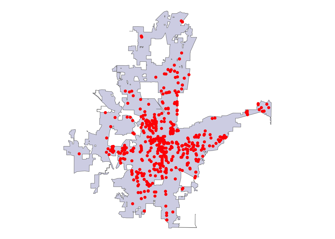
Let’s get started with a dataset I’ve used for the past few years in my data science teaching: public intoxication violations in the city of Fort Worth, Texas from the crime dataset in the city’s open data catalog. The data cover 2019 through March of 2020.
We can plot the data as “red dots” using standard R plotting tools (in this case, ggplot2) over a backdrop of the boundary of the oddly-shaped city of Fort Worth. st_jitter() is used to slightly separate out dots at the same addresses.
The visualization, in its basic form, doesn’t tell us much. We do see a few possible “clusters” of data, but our visual doesn’t do much more at this point than the satirical Clickhole map does.
An alternative approach involves visualizing the data on an interactive map so users can at least zoom and pan around to explore the clusters themselves. We’ll use the MapLibre engine in R’s mapgl package to accomplish this with OpenStreetMap tiles beneath the city boundary and the red dots.
We can explore the data distribution better when zoomed in, but we still don’t get much clarity about patterns when zoomed out. Fortunately, the mapgl package includes some solutions. Let’s take a look at a couple: circle clustering and heatmaps.
Circle clustering in mapgl
A big challenge when mapping dense point data - as we see in this example - is that points will overlap each other when zoomed out, making it difficult to understand the size of point clusters in dense areas. A solution to this is circle clustering, where points within a given radius of one another are packed into clusters, and those clusters are visualized instead of the individual circles. Clusters will dynamically change depending on the user’s zoom level, revealing individual points when a max zoom level is reached.
Circle clustering is implemented in both Mapbox GL JS and MapLibre GL JS, the JavaScript mapping libraries included in the mapgl R package. I’ve built out an interface to the circle clustering functionality in these libraries to try to make it as simple as possible for R users. To cluster circles with default options set, just add cluster_options = cluster_options() to a call to add_circle_layer().
The initial view of the map shows a large cluster in central Fort Worth, and smaller clusters around the outer reaches of the city. Interactivity with clusters is built-in to the package. Try clicking on any given cluster; you’ll see the map zoom in, breaking out those clusters into smaller clusters with updated counts. Once you zoom in close enough, you’ll observe that the greatest concentration of public intoxication violations is found around the West 7th Street entertainment district in the city.
Customizing circle cluster options
mapgl also includes options to customize the behavior and appearance of your clusters. Below, we specify a smaller cluster radius (specified in pixels) within which circles will be included in a cluster. We change the color stops and count stops as well, and add a “blur effect” to the cluster circles.
# Make this more customftw_map |>add_circle_layer(id ="circles",source = intox,circle_color ="red",circle_stroke_color ="white",circle_stroke_width =1,cluster_options =cluster_options(cluster_radius =30,color_stops =c("#377eb8", "#4daf4a", "#984ea3"), count_stops =c(0, 200, 500),circle_blur =0.2,circle_stroke_color ="white",circle_stroke_width =5 ) )
You’ll notice that the smaller cluster radius used causes the cluster circles to overlap each other a bit. Try experimenting with some of the options in cluster_options() to get a more custom look for your cluster maps.
Heatmap layers for dense point data in mapgl
An alternative approach to circle clustering for visualizing dense point data is a heatmap. Heatmaps are cartographic visualizations that show a smoothed density of point features instead of the points themselves. In turn, they are useful tools when you want to smoothly display relative concentration (low to high) on your maps.
Heatmaps with default options are very straightforward to make in mapgl. Use the add_heatmap_layer() function with an sf POINT source, and you’ll get a heatmap.
The default options in MapLibre GL JS use a rainbow color palette and a radius that shows a large blob of intoxication violations across Fort Worth. While these options may make sense for other use-cases, they aren’t great for our initial view given the density of our data. Fortunately we have several options we can customize such as the color, intensity, opacity, and radius.
Customizing heatmap options
Below, we’ll decrease the radius of influence to 10 from the default of 30 pixels; this will “break apart” our large blob when zoomed out. We’ll also set up an alternative color palette for the heatmap with the interpolate() function. Density values will range from 0 to 1; we’ll set locations with values of 0 to transparent, and use the viridis color palette to represent other values.
The map is now more visually coherent when zoomed out, and highlights entertainment districts (West 7th, Downtown, and the Stockyards) with greater concentrations of violations.
But what about our red dots? We may want to retain information for users about individual violations when zoomed in. A fun visual trick we can use is to transition visually between layers and make our heatmap “fade out” once we zoom in to a critical level, at which point the individual violation circles will appear. Below, an interpolate() expression passed to heatmap_opacity smoothly transitions the opacity of the heatmap from 1 to 0 as the user zooms between levels 11 and 14. Circles will re-appear at zoom level 12.5 (using the min_zoom argument), and we add a pop-up with specific information about a given violation. Zoom in and explore!
Zoom in and out to see the “fade effect” in action for the heatmap. Also try clicking a circle to view a custom pop-up; one of my favorite workflows these days is to ask Anthropic’s Claude to write all that HTML for me, getting me styled pop–ups for my maps.