library(mapgl)
library(mapboxapi)

# You'll need a Mapbox access token to use this code. Get one at https://mapbox.com.
# The `mb_access_token()` function sets the access token for all subsequent Mapbox API calls in both the mapboxapi and mapgl packages.
mb_access_token("your_mapbox_access_token_here")

ut_southwestern <- "5323 Harry Hines Blvd, Dallas, TX 75390"

# First, let's geocode our location to get coordinates for a marker
ut_sf <- mb_geocode(ut_southwestern, output = "sf")

# Generate isochrones for noon (minimal traffic)
# mb_isochrone() geocodes address strings internally
iso_12pm <- mb_isochrone(
  ut_southwestern,
  depart_at = "2025-09-11T12:00"
)

# And for rush hour (5:30pm)
iso_530pm <- mb_isochrone(
  ut_southwestern,
  depart_at = "2025-09-11T17:30"
)Time-aware isochrones for accessibility mapping with R and Mapbox tools
r
gis
mapping
navigation
accessibility
If you’ve worked with isochrones before, you know they’re fantastic for accessibility analysis - showing you what areas can be reached from a location within a given travel time. A limitation I’ve run into, however, is that out-of-the-box isochrones often don’t account for traffic patterns. Plus, real traffic data can be difficult and expensive to obtain and integrate into your analysis.
The difference between mid-day and rush hour travel times can be dramatic, especially around major employment centers. I’ll show you how to visualize these differences using time-aware isochrones using Mapbox tools in R with minimal code, then create an interactive comparison that makes the impact of traffic immediately clear.
Time-aware isochrones with mapboxapi
Let’s start with a hospital in Dallas - UT Southwestern Medical Center - and see how accessibility changes throughout the day. The mb_isochrone() function in mapboxapi makes this straightforward with its depart_at parameter. You will need a Mapbox access token, set in your R environment, for this to work.
By specifying depart_at with a future timestamp (formatted as `YYYY-MM-DDTHH:MM), we’re tapping into Mapbox’s predicted traffic data. The API will return isochrones that account for typical traffic patterns on that day of the week and time. Notice we’re using a Thursday here - weekday traffic patterns differ significantly from weekends.
Visualizing isochrones with mapgl
Now that we have our isochrones, let’s visualize them on an interactive map. The mapgl package provides a clean interface to Mapbox GL JS that works perfectly with sf objects from mapboxapi:
map1 <- mapboxgl(bounds = iso_12pm) |>
  add_fill_layer(
    "noon",
    source = iso_12pm,
    fill_color = match_expr(
      column = "time",
      values = c(5, 10, 15),
      stops = c("red", "blue", "green")
    ),
    fill_opacity = 0.75
  ) |>
  add_markers(
    data = ut_sf
  )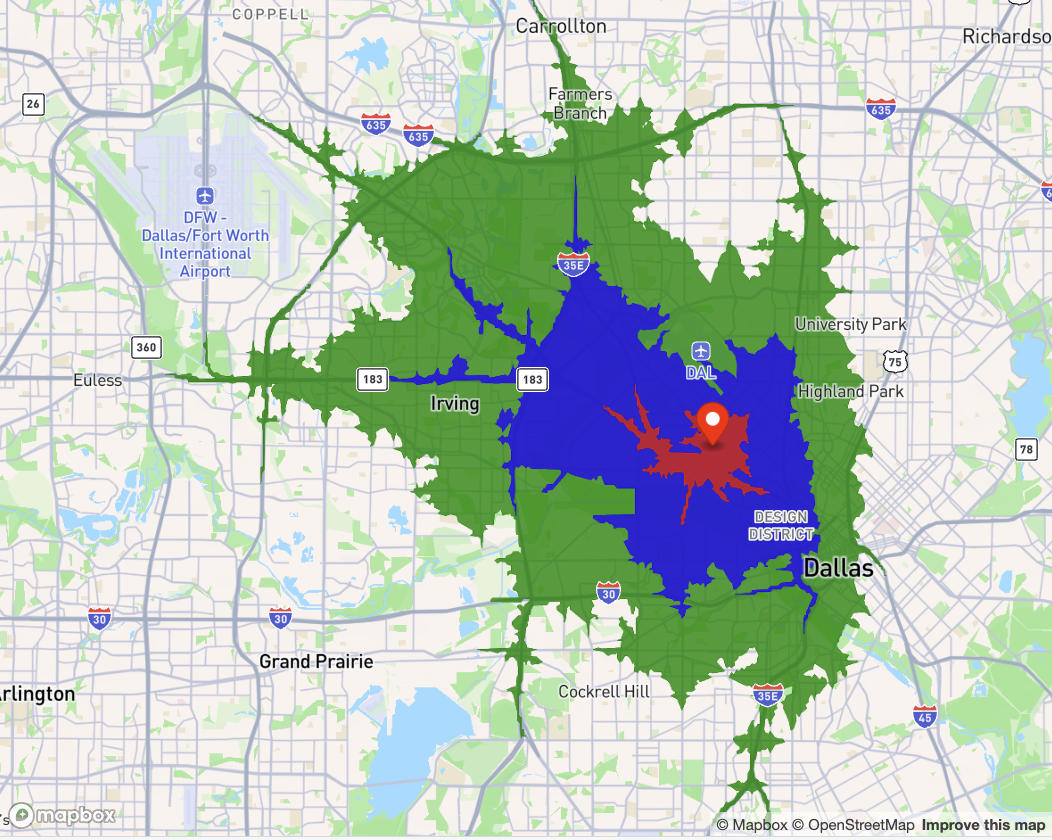
The match_expr() function in mapgl helps us use a Mapbox GL JS match expression to map our data as categorical. I’m using red for the closest (5-minute) area, blue for 10 minutes, and green for the 15-minute drive-time area.
Let’s create the same map for our rush hour isochrones:
map2 <- mapboxgl(bounds = iso_12pm) |>
  add_fill_layer(
    "rush_hour",
    source = iso_530pm,
    fill_color = match_expr(
      column = "time",
      values = c(5, 10, 15),
      stops = c("red", "blue", "green")
    ),
    fill_opacity = 0.75
  ) |>
  add_markers(
    data = ut_sf
  )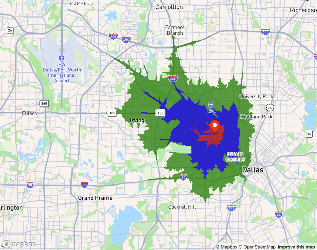
The mapped area at rush hour is much smaller - but it can be difficult to make direct visual comparisons between the two maps, especially as the shapes are complex. Fortunately, the mapgl package has an easy-to-use solution: a comparison slider plugin.
Interactive comparison with a swiper control
Rather than showing two separate maps, we can use mapgl’s compare() function to create an interactive swiper that lets users slide between the noon and rush hour views:
compare(map1, map2, swiper_color = "green") |>
  add_legend(
    "Access (12pm vs. 5:30pm)",
    values = c("5 minutes", "10 minutes", "15 minutes"),
    colors = c("red", "blue", "green"),
    patch_shape = iso_530pm[1,],
    type = "categorical",
    style = legend_style(
      background_opacity = 0.8
    )
  )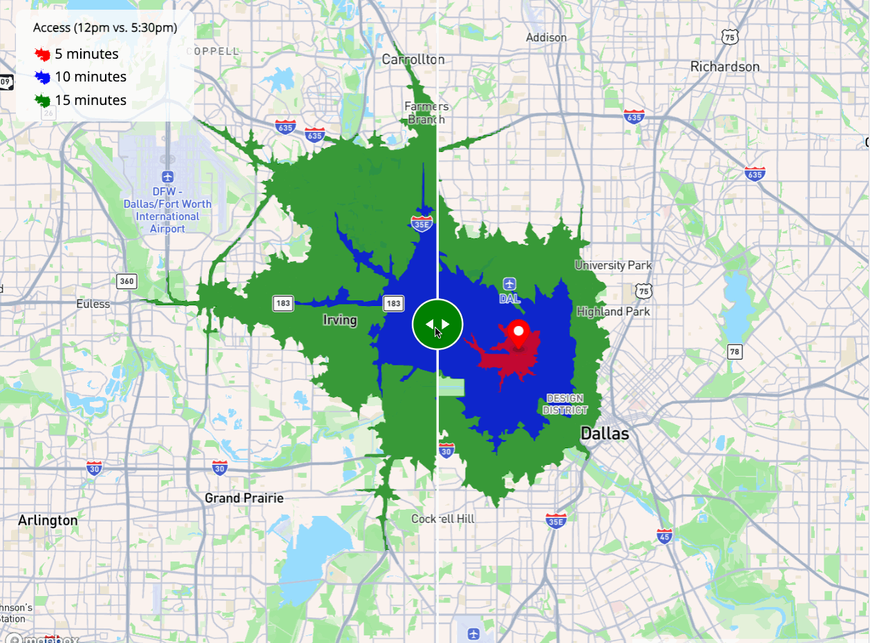
The result is a single interactive map where users can drag the green slider to reveal how dramatically the accessible area shrinks during rush hour. We’re also using the patch_shape parameter in the legend - by passing it an actual isochrone polygon from our data, the legend displays an isochrone-shaped patch instead of the default square patch, aligning better with our displayed isochrones.
Practical applications
This workflow opens up all sorts of analytical possibilities. Medical centers can understand patient accessibility throughout the day. Employers can evaluate office locations based on commute times. Emergency services can plan response coverage accounting for traffic patterns.
The real power here is in the simplicity - we’ve built a sophisticated traffic-aware accessibility visualization in a few dozen lines of R code. Both mapboxapi and mapgl handle the complex parts (API calls, address geocoding, interactive mapping with the comparison slider plugin) so you can focus on analysis and communicating results.
The visualization is great for presenting to stakeholders - and you can use the isochrone objects downstream for additional analysis. I’ve got an example of how to do this in my book.
If you’re interested in implementing time-aware accessibility analysis for your organization, or want a custom workshop on these tools for your team, reach out to kyle@walker-data.com.