4 Exploring US Census data with visualization
The core visualization package within the tidyverse suite of packages is ggplot2 (Wickham 2016). Originally developed by RStudio chief scientist Hadley Wickham, ggplot2 is a widely-used visualization framework by R developers, accounting for 70,000 downloads per day in June 2021 from the RStudio CRAN mirror. ggplot2 allows R users to visualize data using a layered grammar of graphics approach, in which plot objects are initialized upon which the R user layers plot elements.
ggplot2 is an ideal package for visualization of US Census data, especially when obtained in tidy format by the tidycensus package. It has powerful capacity for basic charts, group-wise comparisons, and advanced chart types such as maps.
This chapter includes several examples of how R users can visualize data from the US Census Bureau using ggplot2. Chart types explored in this chapter include basic chart types; faceted, or “small multiples” plots; population pyramids; margin of error plots for ACS data; and advanced visualizations using extensions to ggplot2. Finally, the chapter introduces the plotly package for interactive visualization, which can be used to convert ggplot2 objects to interactive web graphics.
4.1 Basic Census visualization with ggplot2
A critical part of the Census data analysis process is data visualization, where an analyst examines patterns and trends found in their data graphically. In many cases, the exploratory analyses outlined in the previous two chapters would be augmented significantly with accompanying graphics. This first section illustrates some examples for getting started with exploratory Census data visualization with ggplot2.
To get started, we’ll return to a dataset used in Section 2.4.2, which includes data on median household income and median age by county in the state of Georgia from the 2016-2020 ACS. We are requesting the data in wide format, which will spread the estimate and margin of error information across the columns.
library(tidycensus)

ga_wide <- get_acs(
  geography = "county",
  state = "Georgia",
  variables = c(medinc = "B19013_001",
                medage = "B01002_001"),
  output = "wide",
  year = 2020
)
4.1.1 Getting started with ggplot2
ggplot2 visualizations are initialized with the ggplot() function, to which a user commonly supplies a dataset and an aesthetic, defined with the aes() function. Within the aes() function, a user can specify a series of mappings onto either the data axes or other characteristics of the plot, such as element fill or color.
After initializing the ggplot object, users can layer plot elements onto the plot object. Essential to the plot is a geom, which specifies one of many chart types available in ggplot2. For example, geom_bar() will create a bar chart, geom_line() a line chart, geom_point() a point plot, and so forth. Layers are linked to the ggplot object by using the + operator.
One of the first exploratory graphics an analyst will want to produce when examining a new dataset is a histogram, which characterizes the distribution of values in a column through varying lengths of bars. This first example uses ggplot2 and its geom_histogram() function to generate such a histogram of median household income by county in Georgia. The optional call to options(scipen = 999) instructs R to avoid using scientific notation in its output, including on the ggplot2 tick labels.
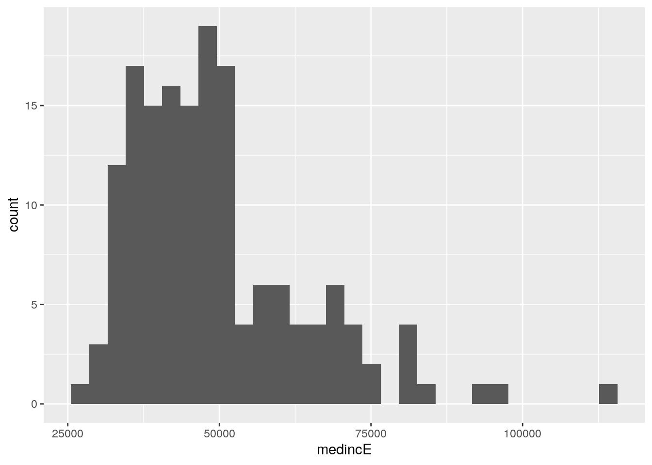
Figure 4.1: Histogram of median household income, Georgia counties
The histogram shows that the modal median household income of Georgia counties is around $40,000 per year, with a longer tail of wealthier counties on the right-hand side of the plot. In the histogram, counties are organized into “bins”, which are groups of equal width along the X-axis. The Y-axis then represents the number of counties that fall within each bin. By default, ggplot2 organizes the data into 30 bins; this option can be changed with the bins parameter. For example, we can re-make the visualization with half the previous number of bins by including the argument bins = 15 in our call to geom_histogram().
ggplot(ga_wide, aes(x = medincE)) +
  geom_histogram(bins = 15)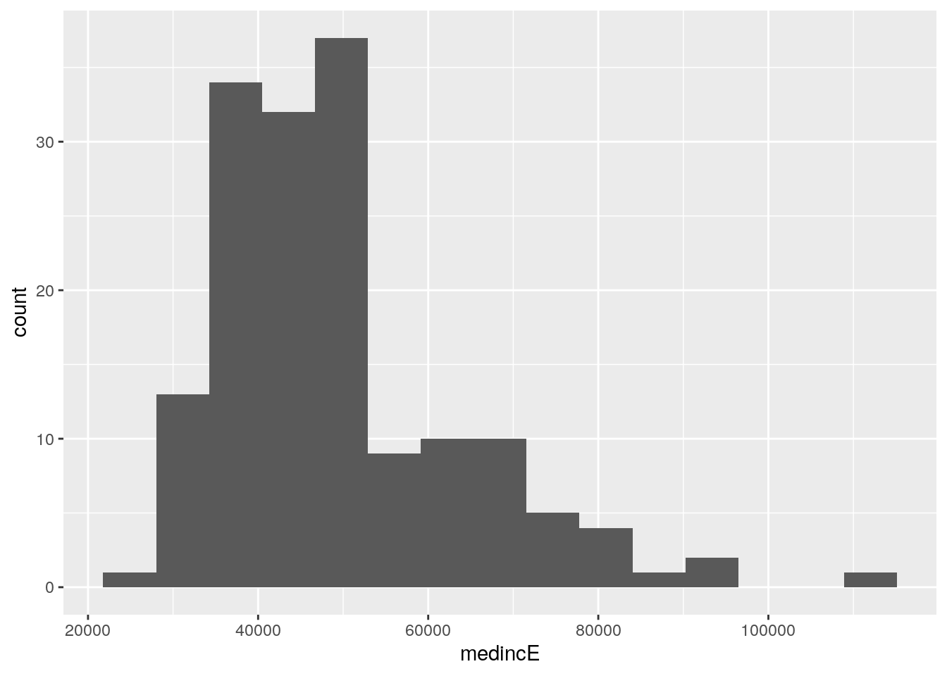
Figure 4.2: Histogram with the number of bins reduced to 15
Histograms are not the only options for visualizing univariate data distributions. A popular alternative is the box-and-whisker plot, which is implemented in ggplot2 with geom_boxplot(). In this example, the column medincE is passed to the y parameter instead of x; this creates a vertical rather than horizontal box plot.
ggplot(ga_wide, aes(y = medincE)) +
  geom_boxplot()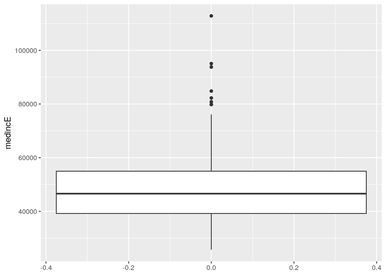
Figure 4.3: Box plot of median household income, Georgia counties
The graphic visualizes the distribution of median household incomes by county in Georgia with a number of different components. The central box covers the interquartile range (the IQR, representing the 25th to 75th percentile of values in the distribution) with a central line representing the value of the distribution’s median. The whiskers then extend to either the minimum and maximum values of the distribution or 1.5 times the IQR. In this example, the lower whisker extends to the minimum value, and the upper whisker extends to 1.5 times the IQR. Values beyond the whiskers are represented as outliers on the plot with points.
4.1.2 Visualizing multivariate relationships with scatter plots
As part of the exploratory data analysis process, analysts will often want to visualize interrelationships between Census variables along with the univariate data distributions discussed above. For two numeric variables, a common exploratory chart is a scatter plot, which maps values in one column to the X-axis and values in another column to the Y-axis. The resulting plot then gives the analyst a sense of the nature of the relationship between the two variables.
Scatter plots are implemented in ggplot2 with the geom_point() function, which plots points on a chart relative to X and Y values for observations in a dataset. This requires specification of two columns in the call to aes() as opposed to the single column used in the univariate distribution visualization examples. The example that follows generates a scatter plot to visualize the relationship between county median age and county median household income in Georgia.
ggplot(ga_wide, aes(x = medageE, y = medincE)) +
  geom_point()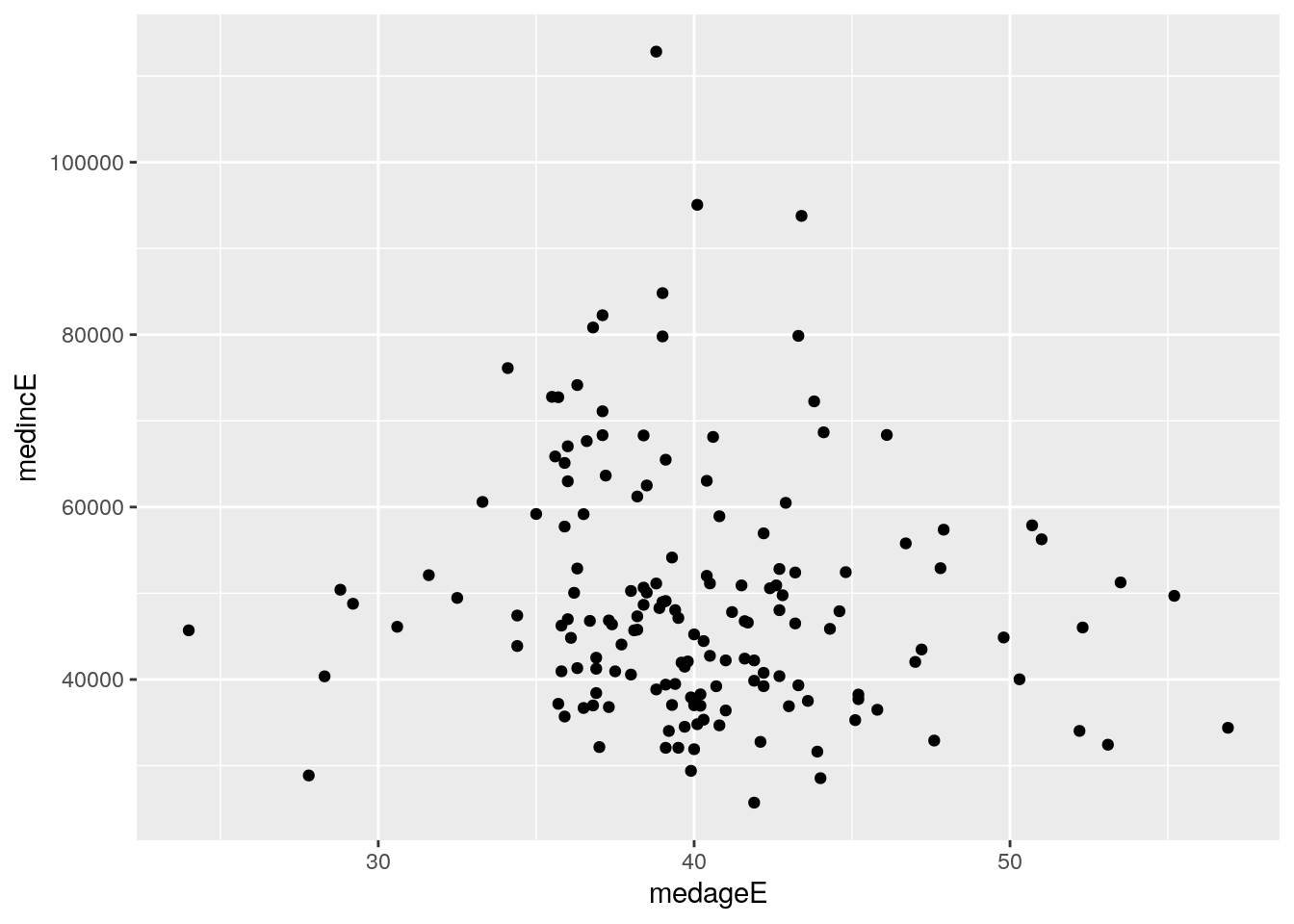
Figure 4.4: Scatter plot of median age and median household income, counties in Georgia
The graphic shows a cloud of points that in some cases can suggest the nature of the correlation between the two columns. In this example, however, the correlation is not immediately clear from the distribution of points. Fortunately, ggplot2 includes the ability to “layer on” additional chart elements to help clarify the nature of the relationship between the two columns. The geom_smooth() function draws a fitted line representing the relationship between the two columns on the plot. The argument method = "lm" draws a straight line based on a linear model fit; smoothed relationships can be visualized as well with method = "loess".
ggplot(ga_wide, aes(x = medageE, y = medincE)) +
  geom_point() +
  geom_smooth(method = "lm")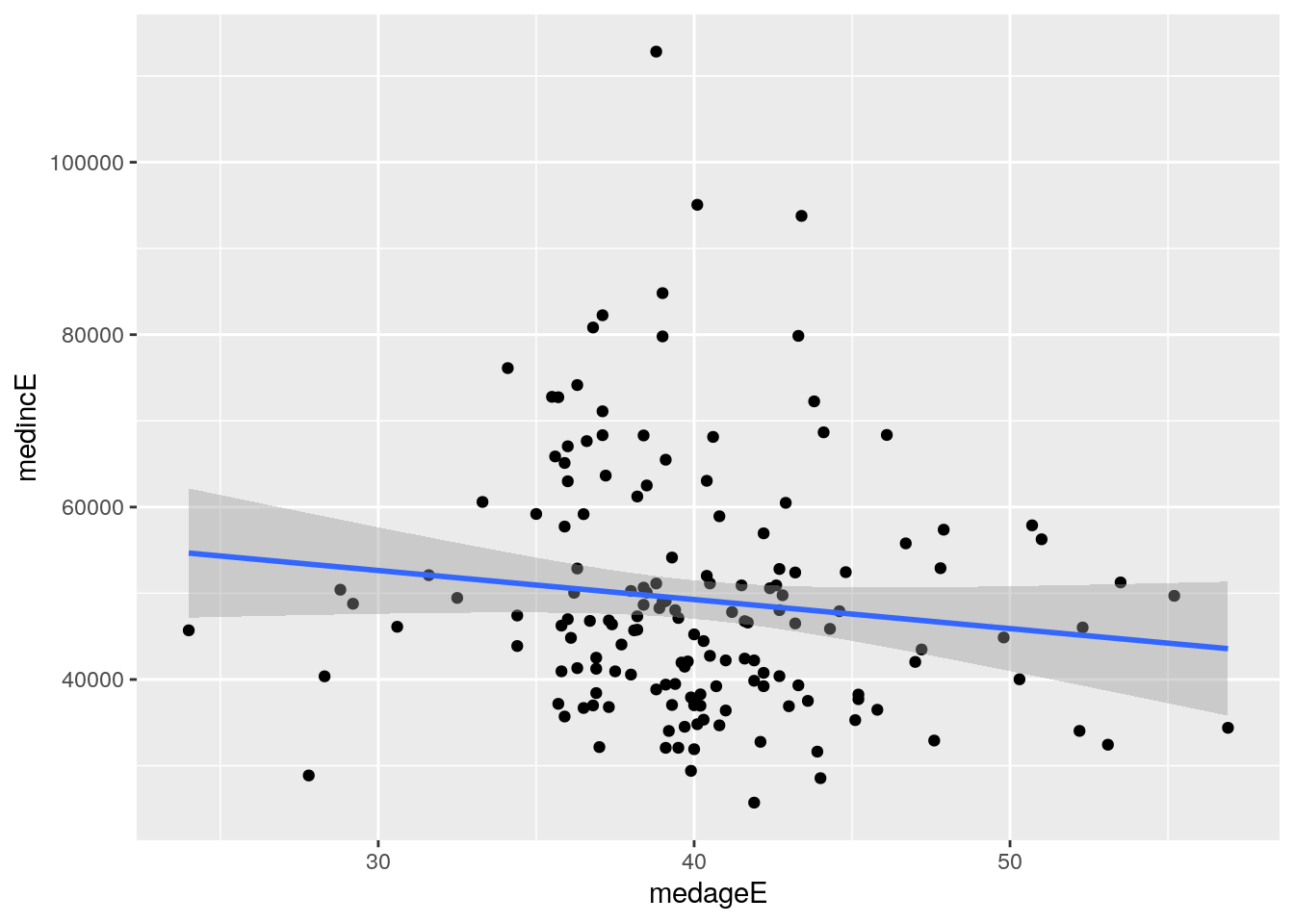
Figure 4.5: Scatter plot with linear relationship superimposed on the graphic
The regression line suggests a modest negative relationship between the two columns, showing that county median household income in Georgia tends to decline slightly as median age increases.
4.2 Customizing ggplot2 visualizations
The attractive defaults of ggplot2 visualizations allow for the creation of legible graphics with little to no customization. This helps greatly with exploratory data analysis tasks where the primary audience is the analyst exploring the dataset. Analysts planning to present their work to an external audience, however, will want to customize the appearance of their plots beyond the defaults to maximize interpretability. This section covers how to take a Census data visualization that is relatively illegible by default and polish it up for eventual presentation and export from R.
In this example, we will create a visualization that illustrates the percent of commuters that take public transportation to work for the largest metropolitan areas in the United States. The data come from the 2019 1-year American Community Survey Data Profile, variable DP03_0021P. To determine this information, we can use tidyverse tools to sort our data by descending order of a summary variable representing total population and then retaining the 20 largest metropolitan areas by population using the slice_max() function.
library(tidycensus)
library(tidyverse)

metros <-  get_acs(
  geography = "cbsa",
  variables = "DP03_0021P",
  summary_var = "B01003_001",
  survey = "acs1",
  year = 2019
) %>%
slice_max(summary_est, n = 20)| GEOID | NAME | variable | estimate | moe | summary_est | summary_moe |
|---|---|---|---|---|---|---|
| 35620 | New York-Newark-Jersey City, NY-NJ-PA Metro Area | DP03_0021P | 31.6 | 0.2 | 19216182 | NA |
| 31080 | Los Angeles-Long Beach-Anaheim, CA Metro Area | DP03_0021P | 4.8 | 0.1 | 13214799 | NA |
| 16980 | Chicago-Naperville-Elgin, IL-IN-WI Metro Area | DP03_0021P | 12.4 | 0.3 | 9457867 | 1469 |
| 19100 | Dallas-Fort Worth-Arlington, TX Metro Area | DP03_0021P | 1.3 | 0.1 | 7573136 | NA |
| 26420 | Houston-The Woodlands-Sugar Land, TX Metro Area | DP03_0021P | 2.0 | 0.2 | 7066140 | NA |
The returned data frame has 7 columns, as is standard for get_acs() with a summary variable, but has 20 rows as specified by the slice_max() command. While the data can be filtered and sorted further to facilitate comparative analysis, it also can be represented succinctly with a visualization. The tidy format returned by get_acs() is well-suited for visualization with ggplot2.
In the basic example below, we can create a bar chart comparing public transportation as commute share for the most populous metropolitan areas in the United States with a minimum of code. The first argument to ggplot() in the example below is the name of our dataset; the second argument is an aesthetic mapping of columns to plot elements, specified inside the aes() function. This plot initialization is then linked with the + operator to the geom_col() function to create a bar chart.
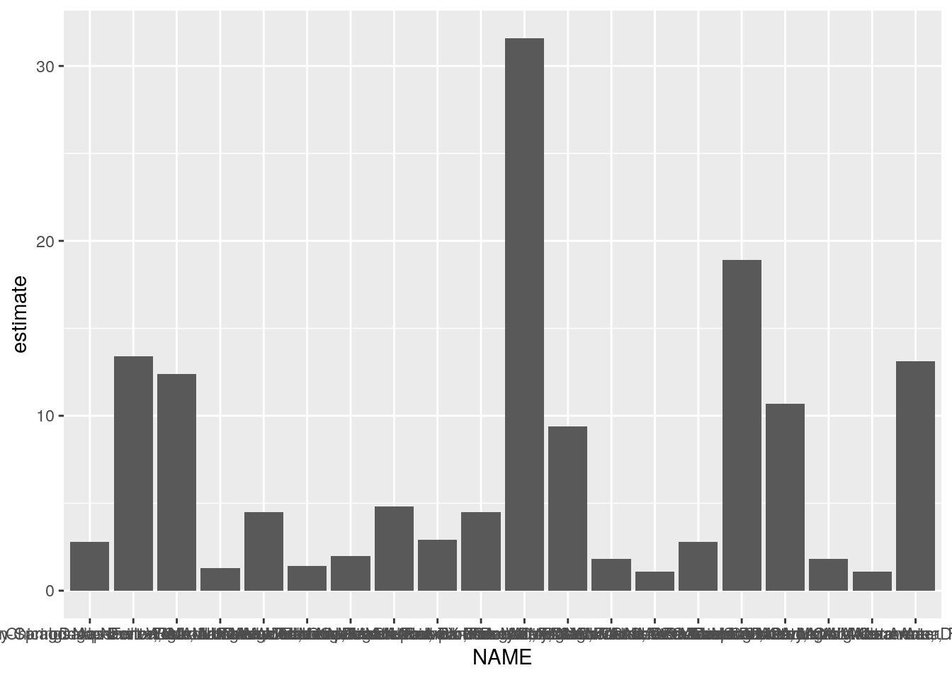
Figure 4.6: A first bar chart with ggplot2
While the above chart is a visualization of the metros dataset, it tells us little about the data given the lack of necessary formatting. The x-axis labels are so lengthy that they overlap and are impossible to read; the axis titles are not intuitive; and the data are not sorted, making it difficult to compare similar observations.
4.2.1 Improving plot legibility
Fortunately, the plot can be made more legible by cleaning up the metropolitan area name, re-ordering the data in descending order, then adding layers to the plot definition. Additionally, ggplot2 visualization can be used in combination with magrittr piping and tidyverse functions, allowing analysts to string together data manipulation and visualization processes.
Our first step will be to format the NAME column in a more intuitive way. The NAME column by default provides a description of each geography as formatted by the US Census Bureau. However, a detailed description like "Atlanta-Sandy Springs-Roswell, GA Metro Area" is likely unnecessary for our chart, as the same metropolitan area can be represented on the chart by the name of its first principal city, which in this case would be "Atlanta". To accomplish this, we can overwrite the NAME column by using the tidyverse function str_remove(), found in the stringr package. The example uses regular expressions to first remove all the text after the first dash, then remove the text after the first comma if no dash was originally present. These two subsequent calls to mutate() will account for the various ways that metropolitan area names are specified.
On the chart, the legibility can be further improved by mapping the metro name to the y-axis and the ACS estimate to the x-axis, and plotting the points in descending order of their estimate values. The ordering of points in this way is accomplished with the reorder() function, used inside the call to aes(). As the result of the mutate() operations is piped to the ggplot() function in this example with the %>% operator, the dataset argument to ggplot() is inferred by the function.
metros %>%
  mutate(NAME = str_remove(NAME, "-.*$")) %>%
  mutate(NAME = str_remove(NAME, ",.*$")) %>%
  ggplot(aes(y = reorder(NAME, estimate), x = estimate)) +
  geom_col()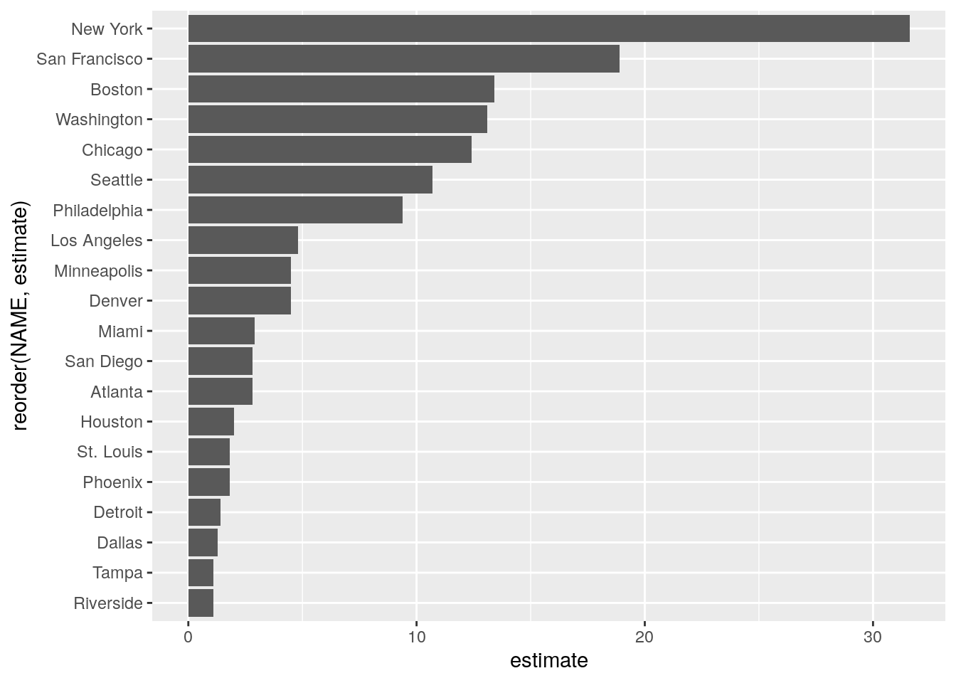
Figure 4.7: An improved bar chart with ggplot2
The plot is much more legible after our modifications. Metropolitan areas can be directly compared with one another, and the metro area labels convey enough information about the different places without overwhelming the plot with long axis labels. However, the plot still lacks information to inform the viewer about the plot’s content. This can be accomplished by specifying labels inside the labs() function. In the example below, we’ll specify a title and subtitle, and modify the X and Y axis labels from their defaults.
metros %>%
  mutate(NAME = str_remove(NAME, "-.*$")) %>%
  mutate(NAME = str_remove(NAME, ",.*$")) %>%
  ggplot(aes(y = reorder(NAME, estimate), x = estimate)) +
  geom_col() +
  theme_minimal() +
  labs(title = "Public transit commute share",
       subtitle = "2019 1-year ACS estimates",
       y = "",
       x = "ACS estimate",
caption = "Source: ACS Data Profile variable DP03_0021P via the tidycensus R package") 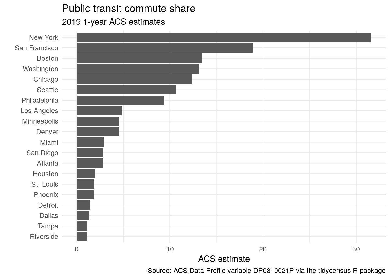
Figure 4.8: A cleaned-up bar chart with ggplot2
The inclusion of labels provides key information about the contents of the plot and also gives it a more polished look for presentation.
4.2.2 Custom styling of ggplot2 charts
While an analyst may be comfortable with the plot as-is, ggplot2 allows for significant customization with respect to stylistic presentation. The example below makes a few such modifications. This includes styling the bars on the plot with a different color and internal transparency; changing the font; and customizing the axis tick labels.
library(scales)

metros %>%
  mutate(NAME = str_remove(NAME, "-.*$")) %>%
  mutate(NAME = str_remove(NAME, ",.*$")) %>%
  ggplot(aes(y = reorder(NAME, estimate), x = estimate)) +
  geom_col(color = "navy", fill = "navy",
           alpha = 0.5, width = 0.85) +
  theme_minimal(base_size = 12, base_family = "Verdana") +
  scale_x_continuous(labels = label_percent(scale = 1)) +
  labs(title = "Public transit commute share",
       subtitle = "2019 1-year ACS estimates",
       y = "",
       x = "ACS estimate",
caption = "Source: ACS Data Profile variable DP03_0021P via the tidycensus R package") 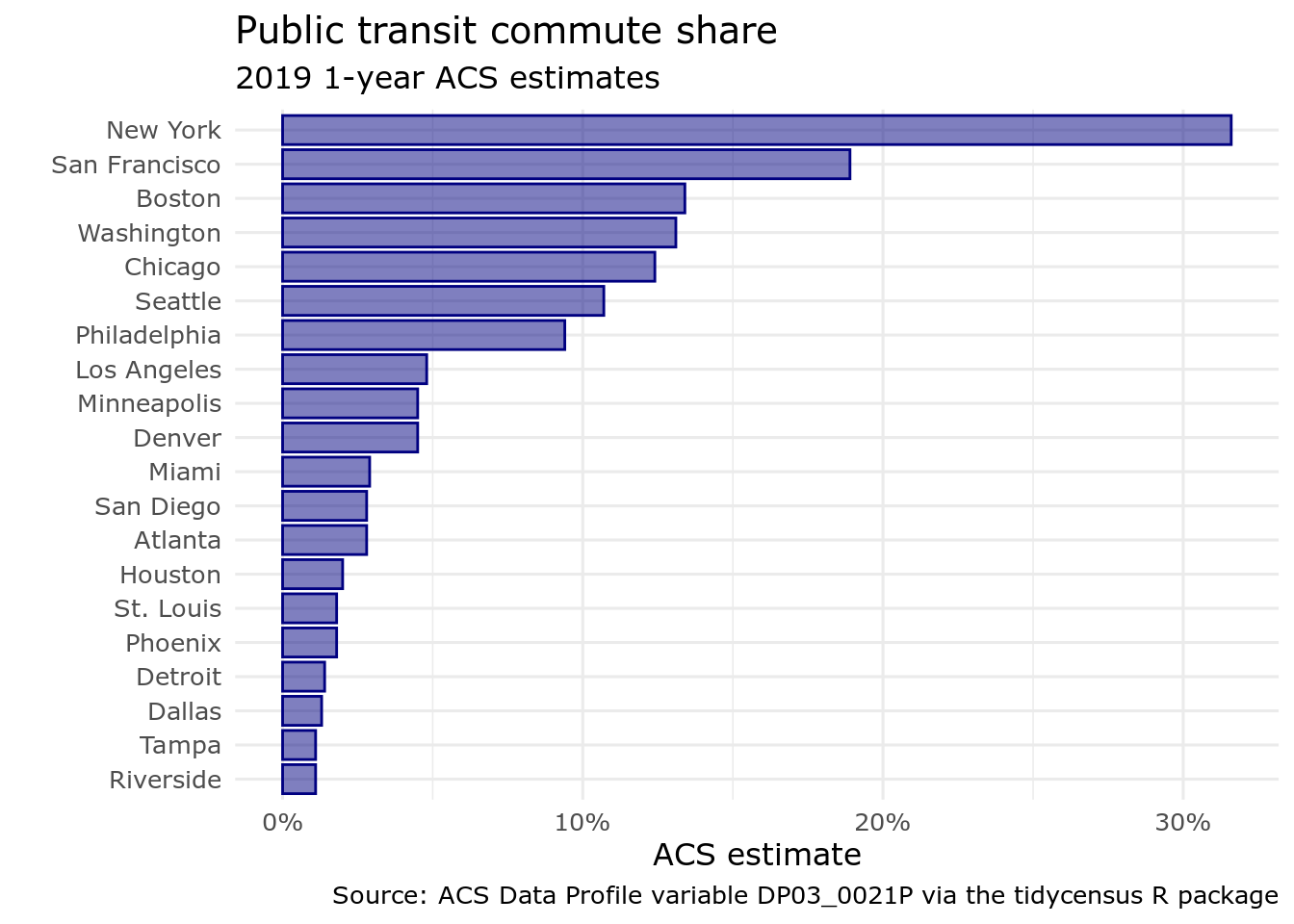
Figure 4.9: A ggplot2 bar chart with custom styling
The code used to produced the styled graphic uses the following modifications:
While aesthetic mappings relative to a column in the input dataset will be specified in a call to
aes(), ggplot2 geoms can be styled directly in their corresponding functions. Bars in ggplot2 are characterized by both a color, which is the outline of the bar, and a fill. The above code sets both to"navy"then modifies the internal transparency of the bar with thealphaargument. Finally,width = 0.85slightly increases the spacing between bars.In the call to
theme_minimal(),base_sizeandbase_familyparameters are available.base_sizespecifies the base font size to which plot text elements will be drawn; this defaults to 11. In many cases, you will want to increasebase_sizeto improve plot legibility.base_familyallows you to change the font family used on your plot. In this example,base_familyis set to"Verdana", but you can use any font families accessible to R from your operating system. To check this information, use thesystem_fonts()function in the systemfonts package (Pedersen, Ooms, and Govett 2021).The
scale_x_continuous()function is used to customize the X-axis of the plot. Thelabelsparameter can accept a range of values including a function (used here) or formula that operates over the tick labels. The scales (Wickham and Seidel, n.d.) package contains many useful formatting functions to neatly present tick labels, such aslabel_percent(),label_dollar(), andlabel_date(). The functions also accept arguments to modify the presentation.
4.2.3 Exporting data visualizations from R
Once an analyst has settled on a visualization design, they may want to export their image from R to display on a website, in a blog post, or in a report. Plots generated in RStudio can be exported with the Export > Save as Image command; however, analysts who want more programmatic control over their image exports can script this with ggplot2. The ggsave() function in ggplot2 will save the last plot generated to an image file in the user’s current working directory by default. The specified file extension will control the output image format, e.g. .png.
ggsave("metro_transit.png")ggsave() includes a variety of options for more fine-grained control over the image output. Common options used by analysts will be width and height to control the image size; dpi to control the image resolution (in dots per inch); and path to specify the directory in which the image will be located. For example, the code below would write the most recent plot generated to an 8 inch by 5 inch image file in a custom location with a resolution of 300 dpi.
ggsave(
  filename = "metro_transit.png",
  path = "~/images",
  width = 8,
  height = 5,
  units = "in",
  dpi = 300
)
4.3 Visualizing margins of error
As discussed in Chapter 3, handling margins of error appropriately is of significant importance for analysts working with ACS data. While tidycensus has tools available for working with margins of error in a data wrangling workflow, it is also often useful to visualize those margins of error to illustrate the degree of uncertainty around estimates, especially when making comparisons between those estimates.
In the above example visualization of public transportation mode share by metropolitan area for the largest metros in the United States, estimates are associated with margins of error; however, these margins of error are relatively small given the large population size of the geographic units represented in the plot. However, if studying demographic trends for geographies of smaller population size - like counties, Census tracts, or block groups - comparisons can be subject to a considerable degree of uncertainty.
4.3.1 Data setup
In the example below, we will compare the median household incomes of counties in the US state of Maine from the 2016-2020 ACS. Before doing so, it is helpful to understand some basic information about counties in Maine, such as the number of counties and their total population. We can retrieve this information with tidycensus and 2020 decennial Census data.
maine <- get_decennial(
  state = "Maine",
  geography = "county",
  variables = c(totalpop = "P1_001N"),
  year = 2020
) %>%
arrange(desc(value))| GEOID | NAME | variable | value |
|---|---|---|---|
| 23005 | Cumberland County, Maine | totalpop | 303069 |
| 23031 | York County, Maine | totalpop | 211972 |
| 23019 | Penobscot County, Maine | totalpop | 152199 |
| 23011 | Kennebec County, Maine | totalpop | 123642 |
| 23001 | Androscoggin County, Maine | totalpop | 111139 |
| 23003 | Aroostook County, Maine | totalpop | 67105 |
| 23017 | Oxford County, Maine | totalpop | 57777 |
| 23009 | Hancock County, Maine | totalpop | 55478 |
| 23025 | Somerset County, Maine | totalpop | 50477 |
| 23013 | Knox County, Maine | totalpop | 40607 |
| 23027 | Waldo County, Maine | totalpop | 39607 |
| 23023 | Sagadahoc County, Maine | totalpop | 36699 |
| 23015 | Lincoln County, Maine | totalpop | 35237 |
| 23029 | Washington County, Maine | totalpop | 31095 |
| 23007 | Franklin County, Maine | totalpop | 29456 |
| 23021 | Piscataquis County, Maine | totalpop | 16800 |
There are sixteen counties in Maine, ranging in population from a maximum of 303,069 to a minimum of 16,800. In turn, estimates for the counties with smaller population sizes are likely to be subject to a larger margin of error than those with larger baseline populations.
Comparing median household incomes of these sixteen counties illustrates this point. Let’s first obtain this data with tidycensus then clean up the NAME column with str_remove() to remove redundant information.
maine_income <- get_acs(
  state = "Maine",
  geography = "county",
  variables = c(hhincome = "B19013_001"),
  year = 2020
) %>%
  mutate(NAME = str_remove(NAME, " County, Maine"))
Using some of the tips covered in the previous visualization section, we can produce a plot with appropriate styling and formatting to rank the counties.
ggplot(maine_income, aes(x = estimate, y = reorder(NAME, estimate))) +
  geom_point(size = 3, color = "darkgreen") +
  labs(title = "Median household income",
       subtitle = "Counties in Maine",
       x = "",
       y = "ACS estimate") +
  theme_minimal(base_size = 12.5) +
  scale_x_continuous(labels = label_dollar())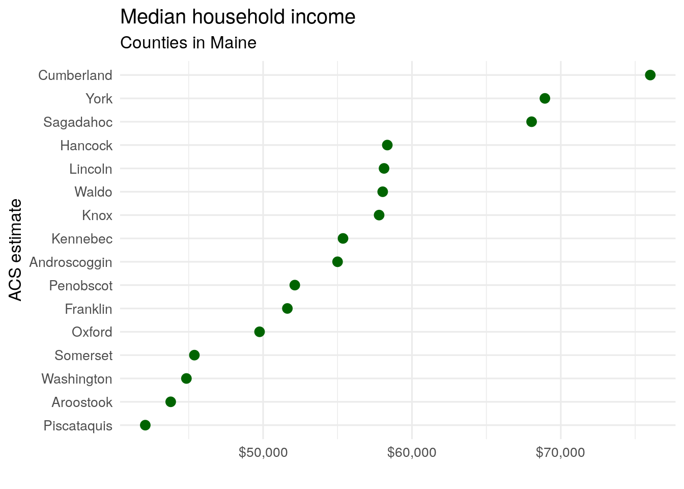
Figure 4.10: A dot plot of median household income by county in Maine
The above visualization suggests a ranking of counties from the wealthiest (Cumberland) to the poorest (Piscataquis). However, the data used to generate this chart is significantly different from the metropolitan area data used in the previous example. In our first example, ACS estimates covered the top 20 US metros by population - areas that all have populations exceeding 2.8 million. For these areas, margins of error are small enough that they do not meaningfully change the interpretation of the estimates given the large sample sizes used to generate them. However, as discussed in Section 3.5, smaller geographies may have much larger margins of error relative to their ACS estimates.
4.3.2 Using error bars for margins of error
Several county estimates on the chart are quite close to one another, which may mean that the ranking of counties is misleading given the margin of error around those estimates. We can explore this by looking directly at the data.
| GEOID | NAME | variable | estimate | moe |
|---|---|---|---|---|
| 23023 | Sagadahoc | hhincome | 68039 | 4616 |
| 23015 | Lincoln | hhincome | 58125 | 3974 |
| 23027 | Waldo | hhincome | 58034 | 3482 |
| 23007 | Franklin | hhincome | 51630 | 2948 |
| 23021 | Piscataquis | hhincome | 42083 | 2883 |
| 23025 | Somerset | hhincome | 45382 | 2694 |
| 23009 | Hancock | hhincome | 58345 | 2593 |
| 23013 | Knox | hhincome | 57794 | 2528 |
| 23017 | Oxford | hhincome | 49761 | 2380 |
| 23003 | Aroostook | hhincome | 43791 | 2306 |
| 23029 | Washington | hhincome | 44847 | 2292 |
| 23031 | York | hhincome | 68932 | 2239 |
| 23011 | Kennebec | hhincome | 55368 | 2112 |
| 23001 | Androscoggin | hhincome | 55002 | 2003 |
| 23019 | Penobscot | hhincome | 52128 | 1836 |
| 23005 | Cumberland | hhincome | 76014 | 1563 |
Specifically, margins of error around the estimated median household incomes vary from a low of $1563 (Cumberland County) to a high of $4616 (Sagadahoc County). In many cases, the margins of error around estimated county household income exceed the differences between counties of neighboring ranks, suggesting uncertainty in the ranks themselves.
In turn, a dot plot like the one above intended to visualize a ranking of county household incomes in Maine may be misleading. However, using visualization tools in ggplot2, we can visualize the uncertainty around each estimate, giving chart readers a sense of the uncertainty in the ranking. This is accomplished with the geom_errorbar() function, which will plot horizontal error bars around each dot that stretch to a given value around each estimate. In this instance, we will use the moe column to determine the lengths of the error bars.
ggplot(maine_income, aes(x = estimate, y = reorder(NAME, estimate))) +
  geom_errorbarh(aes(xmin = estimate - moe, xmax = estimate + moe)) +
  geom_point(size = 3, color = "darkgreen") +
  theme_minimal(base_size = 12.5) +
  labs(title = "Median household income",
       subtitle = "Counties in Maine",
       x = "2016-2020 ACS estimate",
       y = "") +
  scale_x_continuous(labels = label_dollar())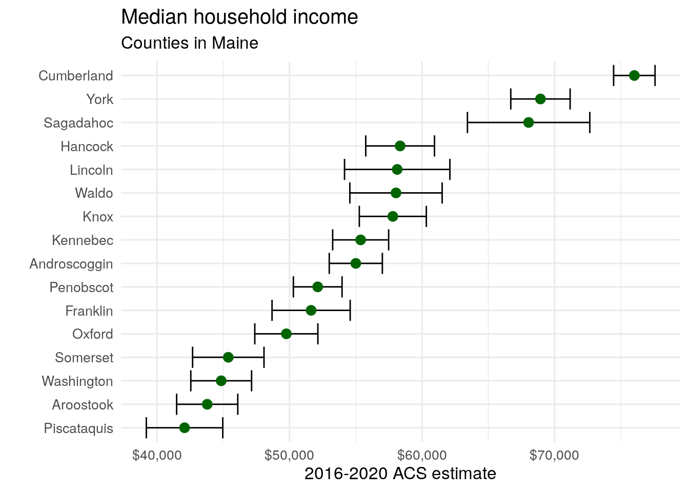
Figure 4.11: Median household income by county in Maine with error bars shown
Adding the horizontal error bars around each point gives us critical information to help us understand how our ranking of Maine counties by median household income. For example, while the ACS estimate suggests that Piscataquis County has the lowest median household income in Maine, the large margin of error around the estimate for Piscataquis County suggests that either Aroostook or Washington Counties could conceivably have lower median household incomes. Additionally, while Hancock County has a higher estimated median household income than Lincoln, Waldo, and Knox Counties, the margin of error plot shows us that this ranking is subject to considerable uncertainty.
4.4 Visualizing ACS estimates over time
Section 3.4.2 covered how to obtain a time series of ACS estimates to explore temporal demographic shifts. While the output table usefully represented the time series of educational attainment in Colorado counties, data visualization is also commonly used to illustrate change over time. Arguably the most common chart type chosen for time-series visualization is the line chart, which ggplot2 handles capably with the geom_line() function.
For an illustrative example, we’ll obtain 1-year ACS data from 2005 through 2019 on median home value for Deschutes County, Oregon, home to the city of Bend and large numbers of in-migrants in recent years from the Bay Area in California. As in Chapter 3, map_dfr() is used to iterate over a named vector of years, creating a time-series dataset of median home value in Deschutes County since 2005, and we use the formula specification for anonymous functions so that ~ .x translates to function(x) x.
years <- 2005:2019
names(years) <- years

deschutes_value <- map_dfr(years, ~{
  get_acs(
    geography = "county",
    variables = "B25077_001",
    state = "OR",
    county = "Deschutes",
    year = .x,
    survey = "acs1"
  )
}, .id = "year")| year | GEOID | NAME | variable | estimate | moe |
|---|---|---|---|---|---|
| 2005 | 41017 | Deschutes County, Oregon | B25077_001 | 236100 | 13444 |
| 2006 | 41017 | Deschutes County, Oregon | B25077_001 | 336600 | 11101 |
| 2007 | 41017 | Deschutes County, Oregon | B25077_001 | 356700 | 16765 |
| 2008 | 41017 | Deschutes County, Oregon | B25077_001 | 331600 | 17104 |
| 2009 | 41017 | Deschutes County, Oregon | B25077_001 | 284300 | 12652 |
| 2010 | 41017 | Deschutes County, Oregon | B25077_001 | 260700 | 18197 |
| 2011 | 41017 | Deschutes County, Oregon | B25077_001 | 216200 | 18065 |
| 2012 | 41017 | Deschutes County, Oregon | B25077_001 | 235300 | 19016 |
| 2013 | 41017 | Deschutes County, Oregon | B25077_001 | 240000 | 16955 |
| 2014 | 41017 | Deschutes County, Oregon | B25077_001 | 257200 | 18488 |
This information can be visualized with familiar ggplot2 syntax. deschutes_value is specified as the input dataset, with year mapped to the X-axis and estimate mapped to the y-axis. The argument group = 1 is used to help ggplot2 understand how to connect the yearly data points with lines given that only one county is being visualized. geom_line() then draws the lines, and we layer points on top of the lines as well to highlight the actual ACS estimates.
ggplot(deschutes_value, aes(x = year, y = estimate, group = 1)) +
  geom_line() +
  geom_point()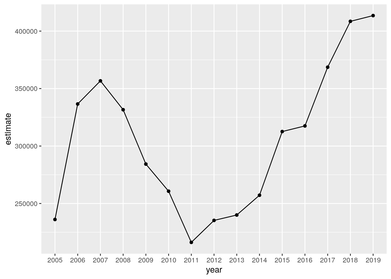
Figure 4.12: A time series chart of median home values in Deschutes County, OR
The chart shows rising home values prior to the 2008 recession; a notable drop after the housing market crash; and rising values since 2011, reflecting increased demand from wealthy in-migrants from locations like the Bay Area. Given what we have learned in previous sections, there are also several opportunities for chart cleanup. This can include more intuitive tick and axis labels; a re-designed visual scheme; and a title and caption. We can also build the margin of error information into the line chart like we did in the previous section. We’ll use the ggplot2 function geom_ribbon() to draw the margin of error interval around the line, helping represent uncertainty in the ACS estimates.
ggplot(deschutes_value, aes(x = year, y = estimate, group = 1)) +
  geom_ribbon(aes(ymax = estimate + moe, ymin = estimate - moe),
              fill = "navy",
              alpha = 0.4) +
  geom_line(color = "navy") +
  geom_point(color = "navy", size = 2) +
  theme_minimal(base_size = 12) +
  scale_y_continuous(labels = label_dollar(scale = .001, suffix = "k")) +
  labs(title = "Median home value in Deschutes County, OR",
       x = "Year",
       y = "ACS estimate",
       caption = "Shaded area represents margin of error around the ACS estimate")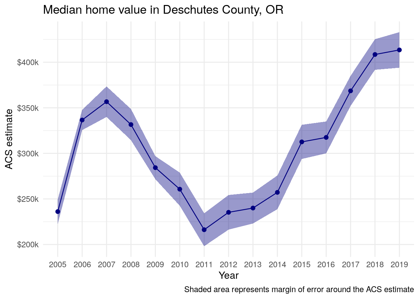
Figure 4.13: The Deschutes County home value line chart with error ranges shown
4.5 Exploring age and sex structure with population pyramids
A common method for visualizing the demographic structure of a particular area is the population pyramid. Population pyramids are typically constructed by visualizing population size or proportion on the x-axis; age cohort on the y-axis; and sex is represented categorically with male and female bars mirrored around a central axis.
4.5.1 Preparing data from the Population Estimates API
We can illustrate this type of visualization using data from the Population Estimates API for the state of Utah. We first obtain data using the get_estimates() function in tidycensus for 2019 population estimates from the Census Bureau’s Population Estimates API.
utah <- get_estimates(
  geography = "state",
  state = "UT",
  product = "characteristics",
  breakdown = c("SEX", "AGEGROUP"),
  breakdown_labels = TRUE,
  year = 2019
) | GEOID | NAME | value | SEX | AGEGROUP |
|---|---|---|---|---|
| 49 | Utah | 3205958 | Both sexes | All ages |
| 49 | Utah | 247803 | Both sexes | Age 0 to 4 years |
| 49 | Utah | 258976 | Both sexes | Age 5 to 9 years |
| 49 | Utah | 267985 | Both sexes | Age 10 to 14 years |
| 49 | Utah | 253847 | Both sexes | Age 15 to 19 years |
| 49 | Utah | 264652 | Both sexes | Age 20 to 24 years |
| 49 | Utah | 251376 | Both sexes | Age 25 to 29 years |
| 49 | Utah | 220430 | Both sexes | Age 30 to 34 years |
| 49 | Utah | 231242 | Both sexes | Age 35 to 39 years |
| 49 | Utah | 212211 | Both sexes | Age 40 to 44 years |
The function returns a long-form dataset in which each row represents population values broken down by age and sex for the state of Utah. However, there are some key issues with this dataset that must be addressed before constructing a population pyramid. First, several rows represent values that we don’t need for our population pyramid visualization. For example, the first few rows in the dataset represent population values for "Both sexes" or for "All ages". In turn, it will be necessary to isolate those rows that represent five-year age bands by sex, and remove the rows that do not. This can be resolved with some data wrangling using tidyverse tools.
In the dataset returned by get_estimates(), five-year age bands are identified in the AGEGROUP column beginning with the word "Age". We can filter this dataset for rows that match this pattern, and remove those rows that represent both sexes. This leaves us with rows that represent five-year age bands by sex. However, to achieve the desired visual effect, data for one sex must mirror another, split by a central vertical axis. To accomplish this, we can set the values for all Male values to negative.
utah_filtered <- filter(utah, str_detect(AGEGROUP, "^Age"),
                  SEX != "Both sexes") %>%
mutate(value = ifelse(SEX == "Male", -value, value))| GEOID | NAME | value | SEX | AGEGROUP |
|---|---|---|---|---|
| 49 | Utah | -127060 | Male | Age 0 to 4 years |
| 49 | Utah | -132868 | Male | Age 5 to 9 years |
| 49 | Utah | -137940 | Male | Age 10 to 14 years |
| 49 | Utah | -129312 | Male | Age 15 to 19 years |
| 49 | Utah | -135806 | Male | Age 20 to 24 years |
| 49 | Utah | -129179 | Male | Age 25 to 29 years |
| 49 | Utah | -111776 | Male | Age 30 to 34 years |
| 49 | Utah | -117335 | Male | Age 35 to 39 years |
| 49 | Utah | -108090 | Male | Age 40 to 44 years |
| 49 | Utah | -89984 | Male | Age 45 to 49 years |
4.5.2 Designing and styling the population pyramid
The data are now ready for visualization. The core components of the pyramid visualization require mapping the population value and the age group to the chart axes. Sex can be mapped to the fill aesthetic allowing for the plotting of these categories by color.
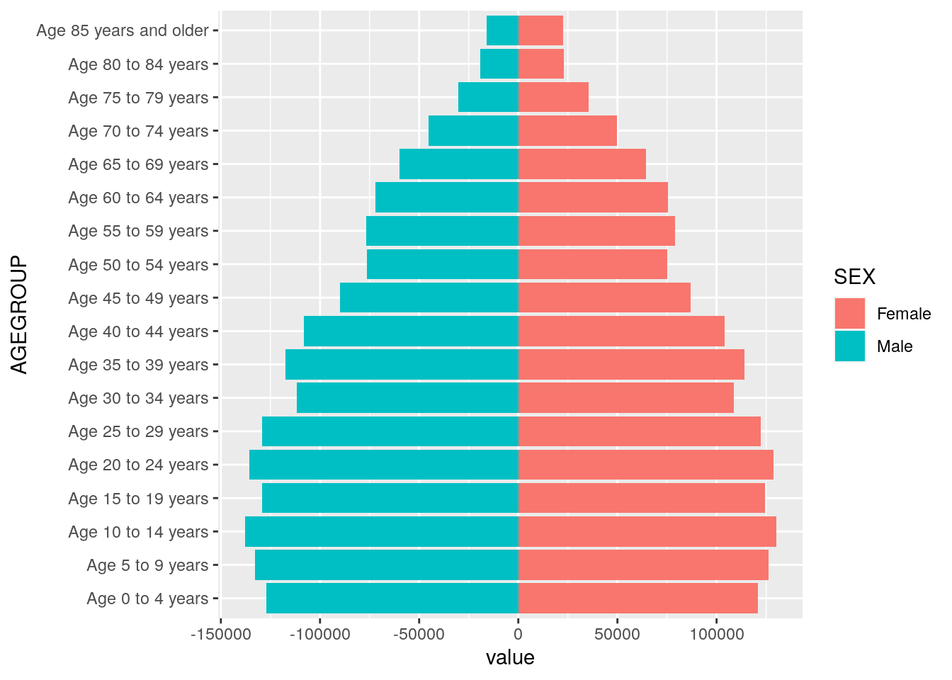
Figure 4.14: A first population pyramid
The visualization represents a functional population pyramid that is nonetheless in need of some cleanup. In particular, the axis labels are not informative; the y-axis tick labels have redundant information (“Age” and “years”); and the x-axis tick labels are difficult to parse. Cleaning up the plot allows us to use some additional visualization options in ggplot2. In addition to specifying appropriate chart labels, we can format the axis tick labels by using appropriate scale_* functions in ggplot2 and setting the X-axis limits to show both sides of 0 equally. In particular, this involves the use of custom absolute values to represent population sizes, and the removal of redundant age group information. We’ll also make use of an alternative ggplot2 theme, theme_minimal(), which uses a white background with muted gridlines.
utah_pyramid <- ggplot(utah_filtered,
                       aes(x = value,
                           y = AGEGROUP,
                           fill = SEX)) +
  geom_col(width = 0.95, alpha = 0.75) +
  theme_minimal(base_family = "Verdana",
                base_size = 12) +
  scale_x_continuous(
    labels = ~ number_format(scale = .001, suffix = "k")(abs(.x)),
    limits = 140000 * c(-1,1)
  ) +
  scale_y_discrete(labels = ~ str_remove_all(.x, "Age\\s|\\syears")) +
  scale_fill_manual(values = c("darkred", "navy")) +
  labs(x = "",
       y = "2019 Census Bureau population estimate",
       title = "Population structure in Utah",
       fill = "",
       caption = "Data source: US Census Bureau population estimates & tidycensus R package")

utah_pyramid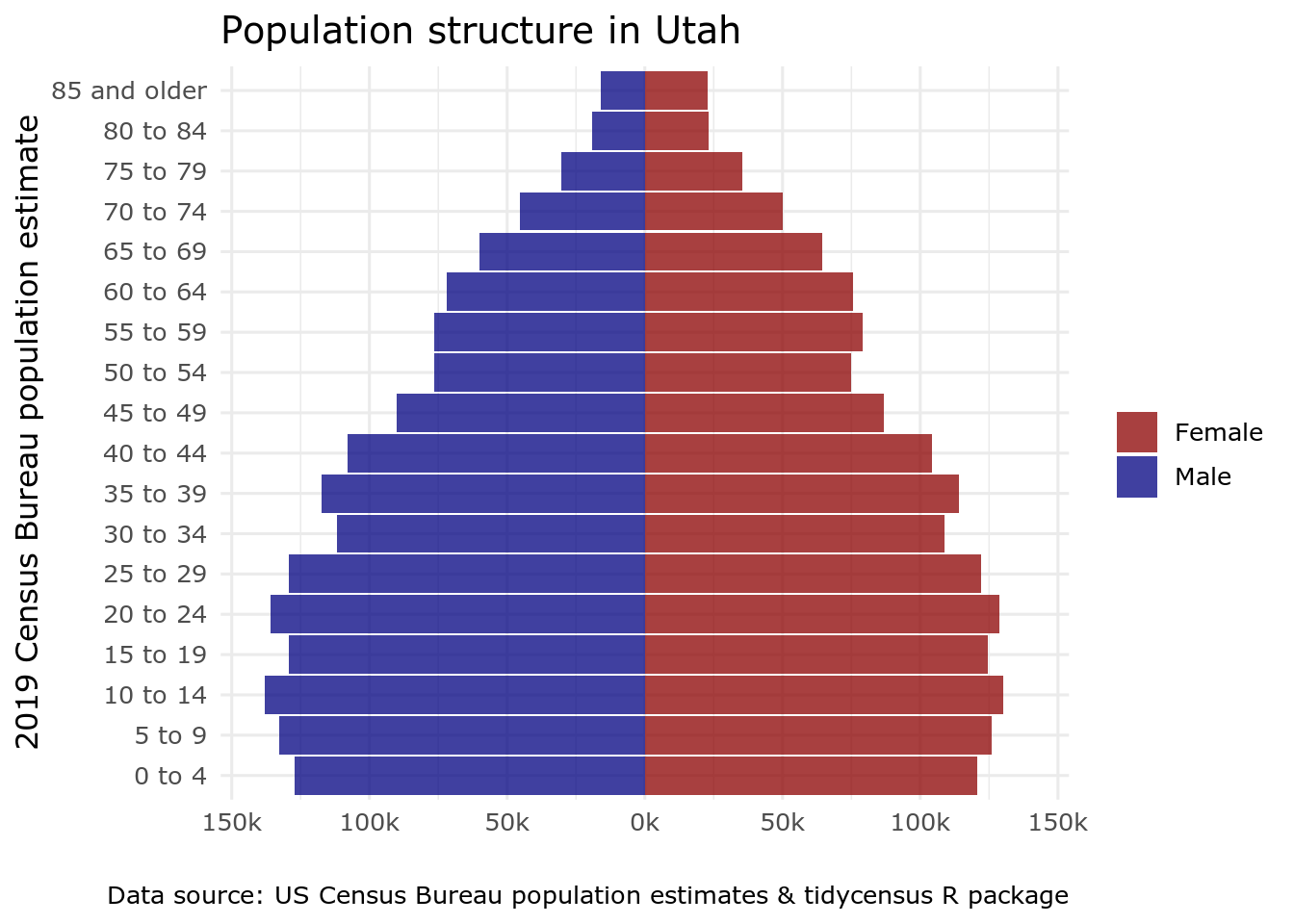
Figure 4.15: A formatted population pyramid of Utah
4.6 Visualizing group-wise comparisons
One of the most powerful features of ggplot2 is its ability to generate faceted plots, which are also commonly referred to as small multiples. Faceted plots allow for the sub-division of a dataset into groups, which are then plotted side-by-side to facilitate comparisons between those groups. This is particularly useful when examining how distributions of values vary across different geographies. An example shown below involves a comparison of median home values by Census tract for three counties in the Portland, Oregon area: Multnomah, which contains the city of Portland, and the suburban counties of Clackamas and Washington.
housing_val <- get_acs(
  geography = "tract",
  variables = "B25077_001",
  state = "OR",
  county = c(
    "Multnomah",
    "Clackamas",
    "Washington",
    "Yamhill",
    "Marion",
    "Columbia"
  ),
  year = 2020
)| GEOID | NAME | variable | estimate | moe |
|---|---|---|---|---|
| 41005020101 | Census Tract 201.01, Clackamas County, Oregon | B25077_001 | 666700 | 131453 |
| 41005020102 | Census Tract 201.02, Clackamas County, Oregon | B25077_001 | 909000 | 130787 |
| 41005020201 | Census Tract 202.01, Clackamas County, Oregon | B25077_001 | 897400 | 97893 |
| 41005020202 | Census Tract 202.02, Clackamas County, Oregon | B25077_001 | 821200 | 93103 |
| 41005020302 | Census Tract 203.02, Clackamas County, Oregon | B25077_001 | 565600 | 32555 |
As with other datasets obtained with tidycensus, the NAME column contains descriptive information that can be parsed to make comparisons. In this case, Census tract ID, county, and state are separated with commas; in turn the tidyverse separate() function can split this column into three columns accordingly.
| GEOID | tract | county | state | variable | estimate | moe |
|---|---|---|---|---|---|---|
| 41005020101 | Census Tract 201.01 | Clackamas County | Oregon | B25077_001 | 666700 | 131453 |
| 41005020102 | Census Tract 201.02 | Clackamas County | Oregon | B25077_001 | 909000 | 130787 |
| 41005020201 | Census Tract 202.01 | Clackamas County | Oregon | B25077_001 | 897400 | 97893 |
| 41005020202 | Census Tract 202.02 | Clackamas County | Oregon | B25077_001 | 821200 | 93103 |
| 41005020302 | Census Tract 203.02 | Clackamas County | Oregon | B25077_001 | 565600 | 32555 |
As explored in previous chapters, a major strength of the tidyverse is its ability to perform group-wise data analysis. The dimensions of median home values by Census tract in each of the three counties can be explored in this way. For example, a call to group_by() followed by summarize() facilitates the calculation of county minimums, means, medians, and maximums.
housing_val2 %>%
  group_by(county) %>%
  summarize(min = min(estimate, na.rm = TRUE),
            mean = mean(estimate, na.rm = TRUE),
            median = median(estimate, na.rm = TRUE),
max = max(estimate, na.rm = TRUE))| county | min | mean | median | max |
|---|---|---|---|---|
| Clackamas County | 62800 | 449940.7 | 426700 | 909000 |
| Columbia County | 218100 | 277590.9 | 275900 | 362200 |
| Marion County | 48700 | 270969.2 | 261200 | 483500 |
| Multnomah County | 192900 | 455706.2 | 425950 | 1033500 |
| Washington County | 221900 | 419618.3 | 406100 | 769700 |
| Yamhill County | 230000 | 333815.8 | 291100 | 545500 |
While these basic summary statistics offer some insights into comparisons between the three counties, they are limited in their ability to help us understand the dynamics of the overall distribution of values. This task can in turn be augmented through visualization, which allows for quick visual comparison of these distributions. Group-wise visualization in ggplot2 can be accomplished with the facet_wrap() function added onto any existing ggplot2 code that has salient groups to visualize. For example, a kernel density plot can show the overall shape of the distribution of median home values in our dataset:
ggplot(housing_val2, aes(x = estimate)) +
  geom_density()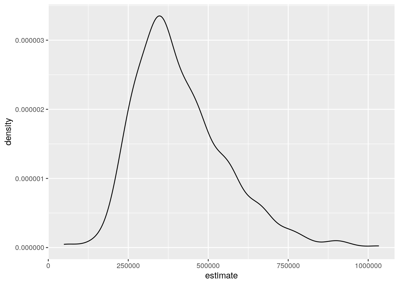
Figure 4.16: A density plot using all values in the dataset
Mapping the county column onto the fill aesthetic will then draw superimposed density plots by county on the chart:
ggplot(housing_val2, aes(x = estimate, fill = county)) +
  geom_density(alpha = 0.3)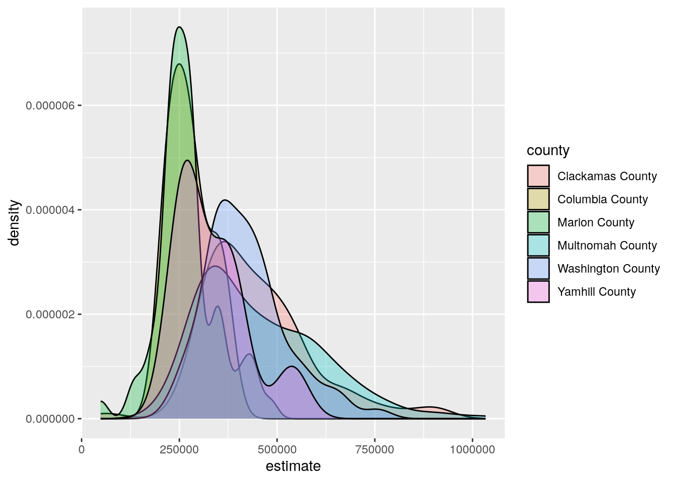
Figure 4.17: A density plot with separate curves for each county
Alternatively, adding the facet_wrap() function, and specifying county as the column used to group the data, splits this visualization into side-by-side graphics based on the counties to which each Census tract belongs.
ggplot(housing_val2, aes(x = estimate)) +
  geom_density(fill = "darkgreen", color = "darkgreen", alpha = 0.5) +
  facet_wrap(~county) +
  scale_x_continuous(labels = dollar_format(scale = 0.000001,
                                            suffix = "m")) +
  theme_minimal(base_size = 14) +
  theme(axis.text.y = element_blank(),
        axis.text.x = element_text(angle = 45)) +
  labs(x = "ACS estimate",
       y = "",
       title = "Median home values by Census tract, 2015-2019 ACS")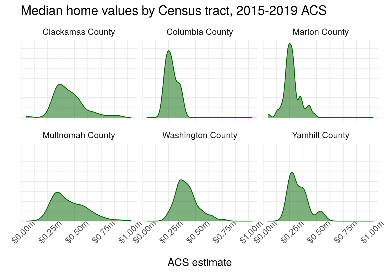
Figure 4.18: An example faceted density plot
The side-by-side comparative graphics show how the value distributions vary between the three counties. Home values in all three counties are common around $250,000, but Multnomah County has some Census tracts that represent the highest values in the dataset.
4.7 Advanced visualization with ggplot2 extensions
While the core functionality of ggplot2 is very powerful, a notable advantage of using ggplot2 for visualization is the contributions made by its user community in the form of extensions. ggplot2 extensions are packages developed by practitioners outside the core ggplot2 development team that add functionality to the package. I encourage you to review the gallery of ggplot2 extensions from the extensions website; I highlight some notable examples below.
4.7.1 ggridges
The ggridges package (Wilke 2021) adapts the concept of the faceted density plot to generate ridgeline plots, in which the densities overlap one another. The example below creates a ridgeline plot using the Portland-area home value data; geom_density_ridges() generates the ridgelines, and theme_ridges() styles the plot in an appropriate manner.
library(ggridges)

ggplot(housing_val2, aes(x = estimate, y = county)) +
  geom_density_ridges() +
  theme_ridges() +
  labs(x = "Median home value: 2016-2020 ACS estimate",
       y = "") +
  scale_x_continuous(labels = label_dollar(scale = .000001, suffix = "m"),
                     breaks = c(0, 500000, 1000000)) +
  theme(axis.text.x = element_text(angle = 45))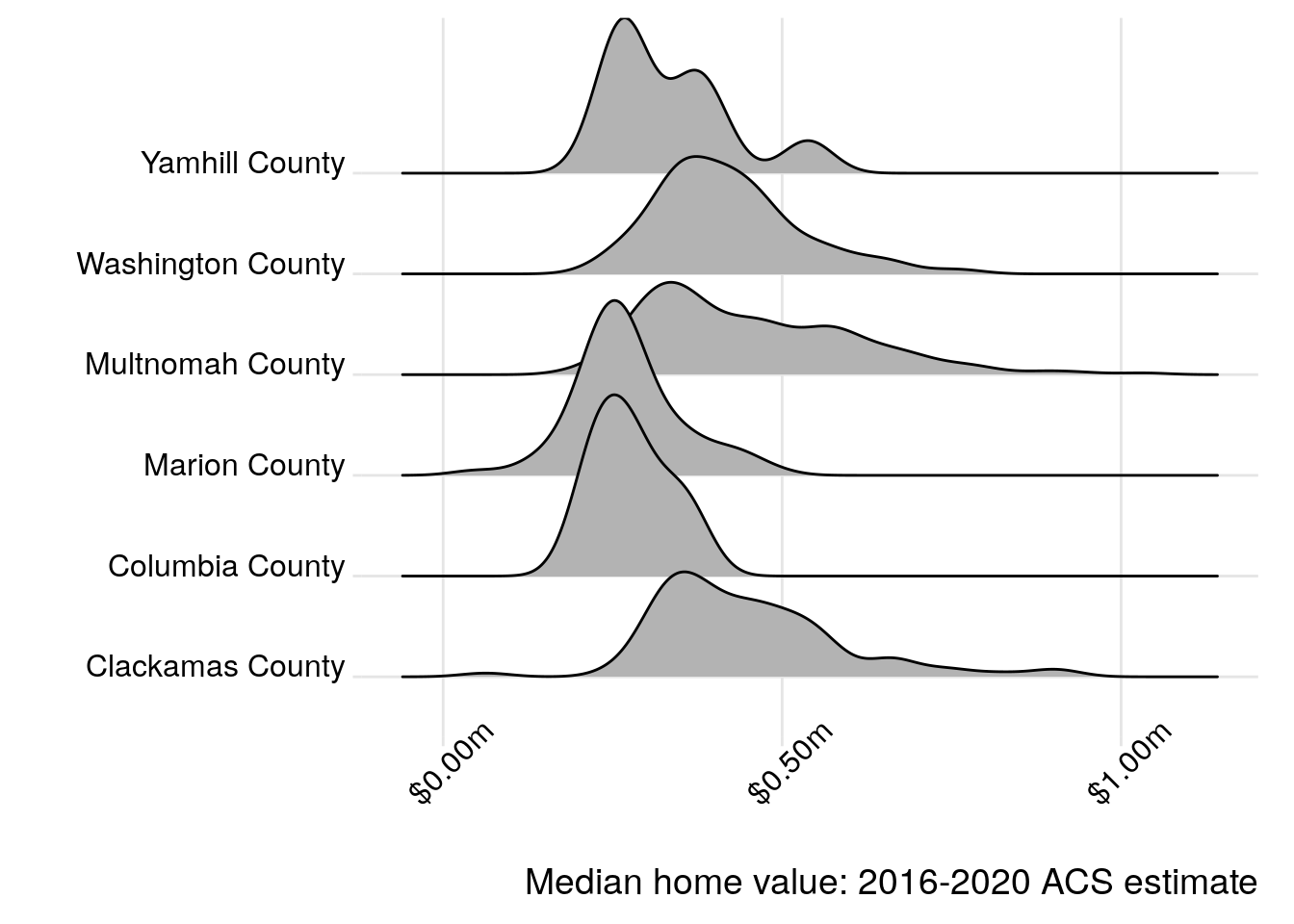
Figure 4.19: Median home values in Portland-area counties visualized with ggridges
The overlapping density “ridges” offer both a pleasing aesthetic but also a practical way to compare the different data distributions. As ggridges extends ggplot2, analysts can style the different chart components to their liking using the methods introduced earlier in this chapter.
4.7.2 ggbeeswarm
The ggbeeswarm package (Clarke and Sherrill-Mix 2017) extends ggplot2 by allowing users to generate beeswarm plots, in which clouds of points are jittered to show the overall density of a distribution of data values. Beeswarm plots can be compelling ways to visualize multiple data variables on a chart, such as the distributions of median household income by the racial and ethnic composition of neighborhoods. This is the motivating example for the chart below, which looks at household income by race/ethnicity in New York City. The data wrangling in the first part of the code chunk takes advantage of some of the skills covered in Chapters 2 and 3, allowing for visualization of household income distributions by the largest group in each Census tract.
library(ggbeeswarm)

ny_race_income <- get_acs(
  geography = "tract",
  state = "NY",
  county = c("New York", "Bronx", "Queens", "Richmond", "Kings"),
  variables = c(White = "B03002_003",
                Black = "B03002_004",
                Asian = "B03002_006",
                Hispanic = "B03002_012"),
  summary_var = "B19013_001",
  year = 2020
) %>%
  group_by(GEOID) %>%
  filter(estimate == max(estimate, na.rm = TRUE)) %>%
  ungroup() %>%
  filter(estimate != 0)

ggplot(ny_race_income, aes(x = variable, y = summary_est, color = summary_est)) +
  geom_quasirandom(alpha = 0.5) +
  coord_flip() +
  theme_minimal(base_size = 13) +
  scale_color_viridis_c(guide = "none") +
  scale_y_continuous(labels = label_dollar()) +
  labs(x = "Largest group in Census tract",
       y = "Median household income",
       title = "Household income distribution by largest racial/ethnic group",
       subtitle = "Census tracts, New York City",
       caption = "Data source: 2016-2020 ACS")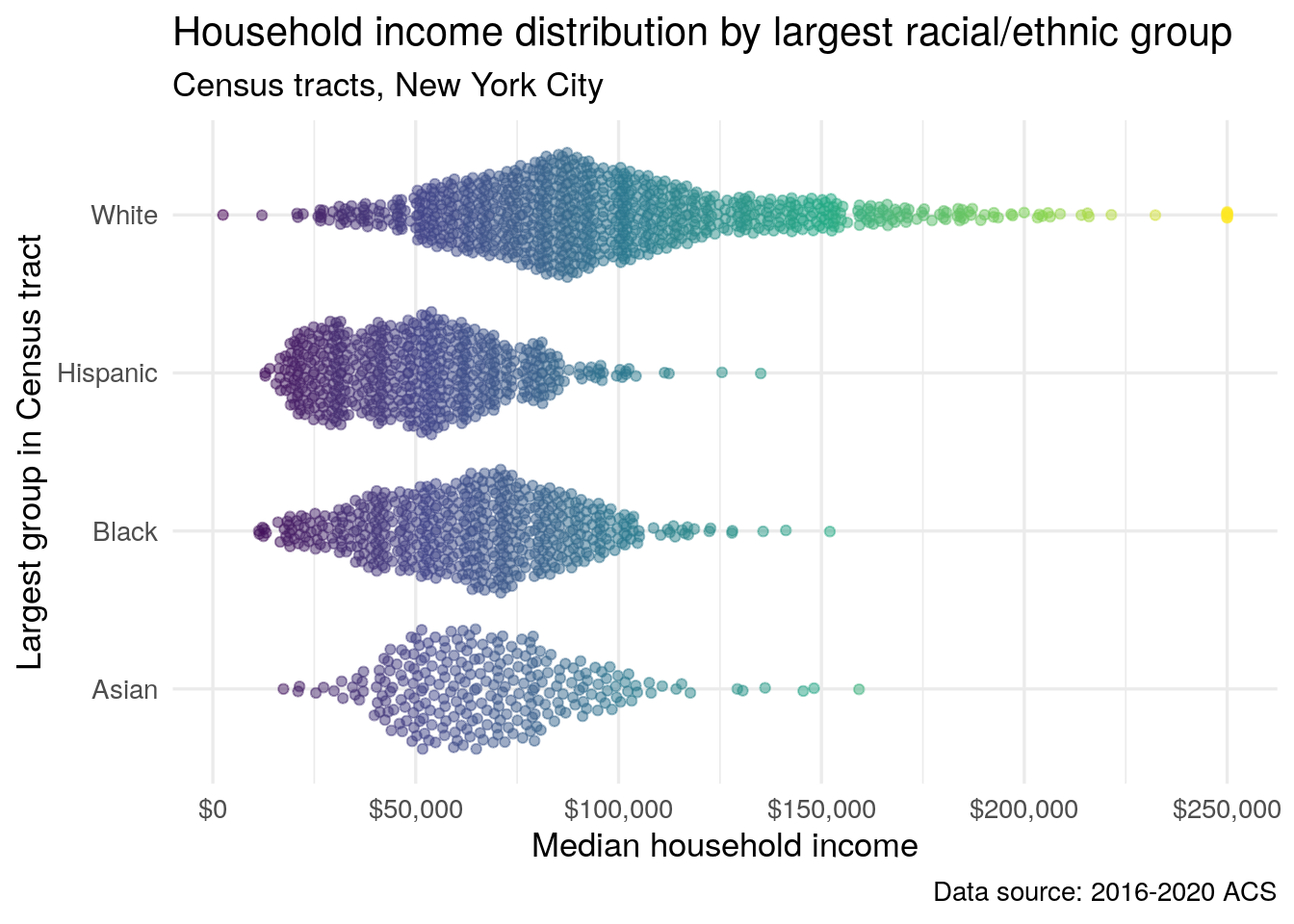
Figure 4.20: A beeswarm plot of median household income by most common racial or ethnic group, NYC Census tracts
The plot shows that the wealthiest neighborhoods in New York City - those with median household incomes exceeding $150,000 - are all plurality or majority non-Hispanic white. However, the chart also illustrates that there are a range of values among neighborhoods with pluralities of the different racial and ethnic groups, suggesting a nuanced portrait of the intersections between race and income inequality in the city.
4.7.3 Geofaceted plots
The next four chapters of the book, Chapters 5 through 8, are all about spatial data, mapping, and spatial analysis. Geographic location can be incorporated into Census data visualizations without using geographic information explicitly by way of the geofacet package (Hafen 2020). Geofaceted plots are enhanced versions of faceted visualizations that arrange subplots in relationship to their relative geographic location. The geofacet package has over 100 available grids to choose from allowing for faceted plots for US states, counties, and regions around the world. The key is to use a column that can map correctly to information in the geofaceted grid that you are using.
In the example below, we replicate the population pyramid code above to generate population pyramids for each state in the US. However, we also modify the output data so that the population information reflects the proportion of the overall population for each state so that all states are on consistent scales. The population pyramid code is similar, though the axis information is unnecessary as it will be stripped from the final plot.
library(geofacet)

us_pyramid_data <- get_estimates(
  geography = "state",
  product = "characteristics",
  breakdown = c("SEX", "AGEGROUP"),
  breakdown_labels = TRUE,
  year = 2019
) %>%
  filter(str_detect(AGEGROUP, "^Age"),
         SEX != "Both sexes") %>%
  group_by(NAME) %>%
  mutate(prop = value / sum(value, na.rm = TRUE)) %>%
  ungroup() %>%
  mutate(prop = ifelse(SEX == "Male", -prop, prop))

ggplot(us_pyramid_data, aes(x = prop, y = AGEGROUP, fill = SEX)) +
  geom_col(width = 1) +
  theme_minimal() +
  scale_fill_manual(values = c("darkred", "navy")) +
  facet_geo(~NAME, grid = "us_state_with_DC_PR_grid2",
            label = "code") +
  theme(axis.text = element_blank(),
        strip.text.x = element_text(size = 8)) +
  labs(x = "",
       y = "",
       title = "Population structure by age and sex",
       fill = "",
       caption = "Data source: US Census Bureau population estimates & tidycensus R package")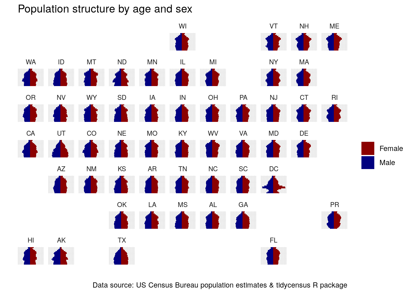
Figure 4.21: Geofaceted population pyramids of US states
The result is a compelling visualization that expresses general geographic relationships and patterns in the data while showing comparative population pyramids for all states. The unique nature of Washington, DC stands out with its large population in their 20s and 30s; we can also compare Utah, the youngest state in the country, with older states in the Northeast.
If this specific grid arrangement is not to your liking (e.g. Minnesotans may take issue with Wisconsin to the north!), try out some of the other built-in grid options in the package. Also, you can use the grid_design() function in the geofacet package to pull up an interactive app in which you can design your own grid for use in geofaceted plots!
4.7.4 Interactive visualization with plotly
The htmlwidgets package (Vaidyanathan et al. 2020) provides a bridge between JavaScript libraries for interactive web-based data visualization and the R language. Since 2015, the R community has released hundreds of packages that depend on htmlwidgets and bring interactive data visualization to R. One of the most popular packages for interactive visualization is the plotly package (Sievert 2020), an interface to the Plotly visualization library.
plotly is a well-developed library that allows for many different types of custom visualizations. However, one of the most useful functions in the plotly package is arguably the simplest. The ggplotly() function can convert an existing ggplot2 graphic into an interactive web visualization in a single line of code! Let’s try it out here with the utah_pyramid population pyramid:
Figure 4.22: An interactive population pyramid rendered with ggplotly
Try hovering your cursor over the different bars; this reveals a tooltip that shares information about the data. The legend is interactive, as data series can be clicked on and off; viewers can also pan and zoom on the plot using the toolbar that appears in the upper right corner of the visualization. Interactive graphics like this are an excellent way to facilitate additional data exploration, and can be polished further for presentation on the web.
4.8 Learning more about visualization
This chapter has introduced a series of visualization techniques implemented in ggplot2 that are appropriate for US Census Bureau data. Readers may want to learn more about effective principles for visualization design and communication and apply that to the techniques covered here. While Chapter 6 covers some of these principles in brief, literature that focuses specifically on these topics will be more comprehensive. Munzner (2014) is an in-depth overview of visualization techniques and design principles, and offers a corresponding website with lecture slides. Evergreen (2020) and Knaflic (2015) provide guidelines for effective communication with visualization and both offer excellent design tips for business and general audiences. R users may be interested in Wilke (2019) and Healy (2019), which both offer a comprehensive overview of data visualization best practices along with corresponding R code to reproduce the figures in their books.
4.9 Exercises
Choose a different variable in the ACS and/or a different location and create a margin of error visualization of your own.
Modify the population pyramid code to create a different, customized population pyramid. You can choose a different location (state or county), different colors/plot design, or some combination!